
📌
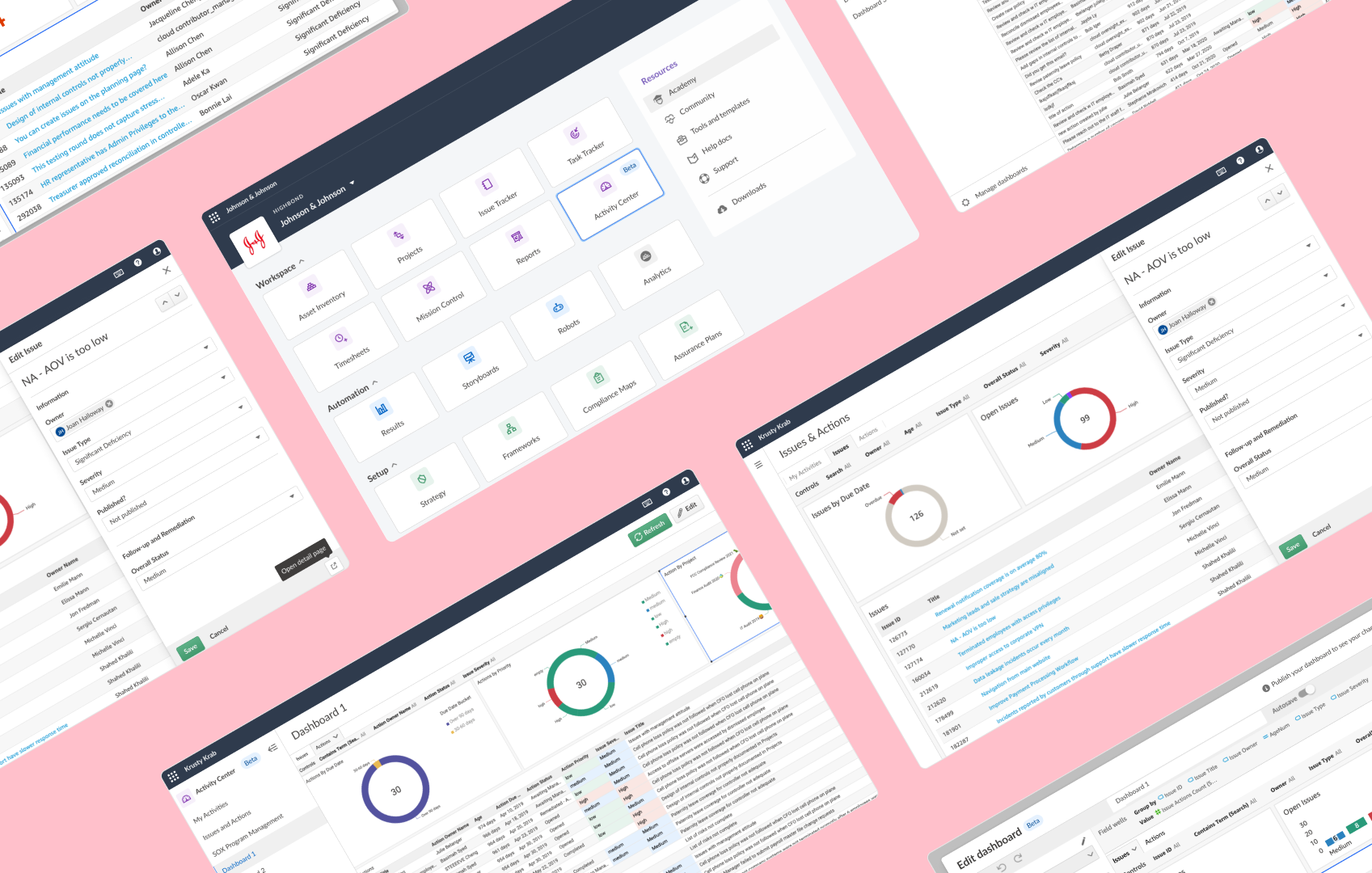
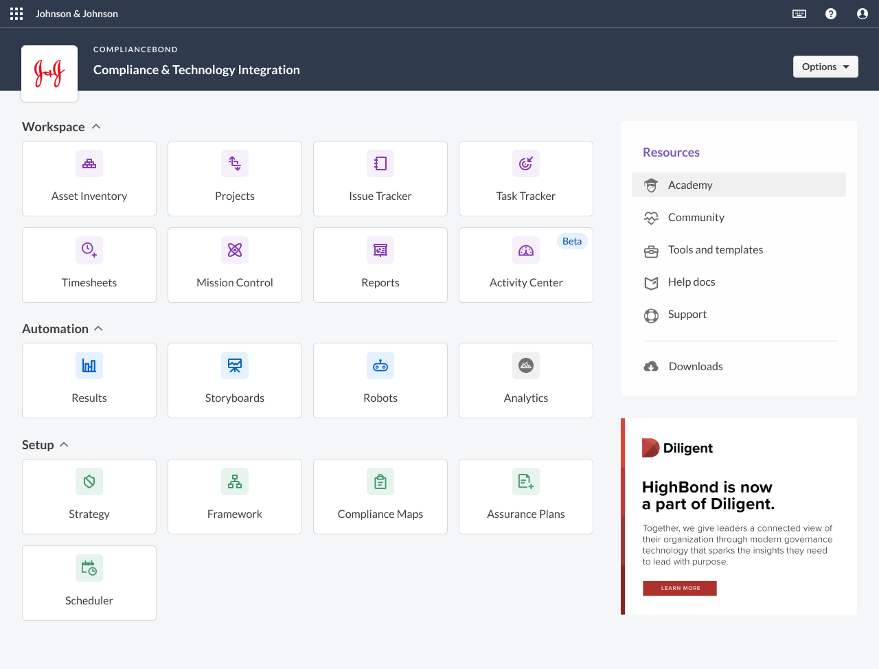
highbond activity center
Role: UX Designer at Galvanize
Date: Jan 2022
Industry: Governance, Risk and Compliance
- 1 Senior UX Designer
- 1 UX Designer (me)
- 1 Product Manager
- 3 Principal Engineers
- VP of Product
- VP of Engineering
- 3 Subject Matter Experts
- Technical Writers
- Localization Team
background
In my role as a UX Designer at Galvanize, I worked on a project that revolved around data-driven insights. HighBond, our flagship platform, assists professionals in managing governance, risk, and compliance (GRC) programs. As the platform's complexity grew, it became essential to streamline interactions and make key insights more accessible.
During a transformative period after Diligent’s acquisition of Galvanize, we aimed to modernize the navigation of the Projects app, crucial for auditing management. Concurrently, our engineering team discovered AWS QuickSight, a third-party analytics tool with potential to address platform challenges without technical debt.
A cross-functional team was formed, including principal engineers and designers. Collaboratively, we explored QuickSight's capabilities and how they aligned with user pain points. We iteratively refined data visualization and interactions, prioritizing user-centric design throughout.
Notably, we engaged customers in a beta program, co-creating this feature in increments. Leveraging Pendo, we gathered adoption and usage analytics, offering real-time insights. This collaborative effort culminated in a new Activity Centers app. Pendo data validated our design choices, confirming the app's positive impact.
Our Objectives
- Simplify and modernize an aging platform
- Improve work status visibility for individual contributors and decision-makers for different solution groups (SOX Audits, IT Risk, ESG etc)
- Provide a proof of concept (PoC) to stakeholders for potential to ‘merge’ two platforms after an acquisition
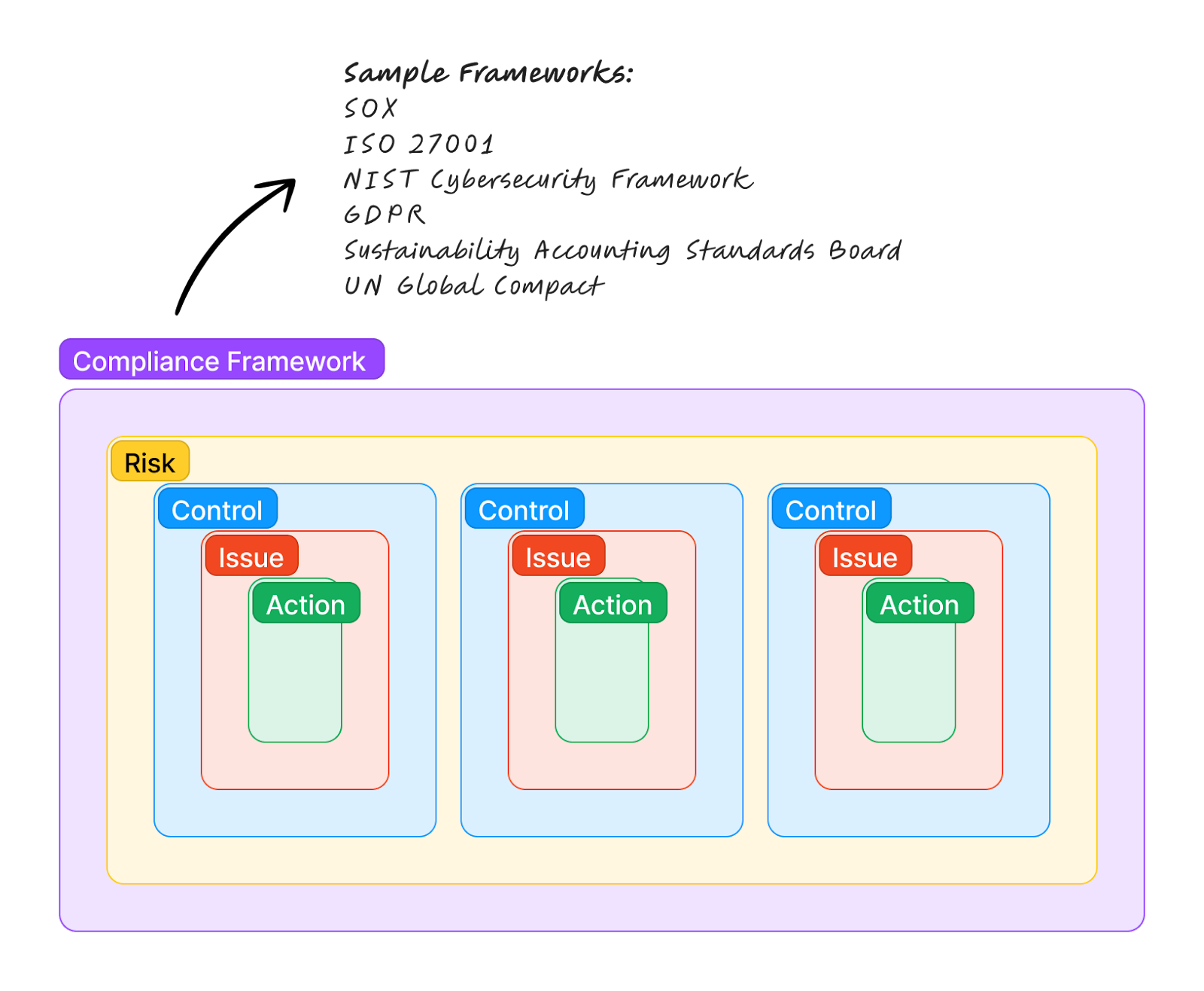
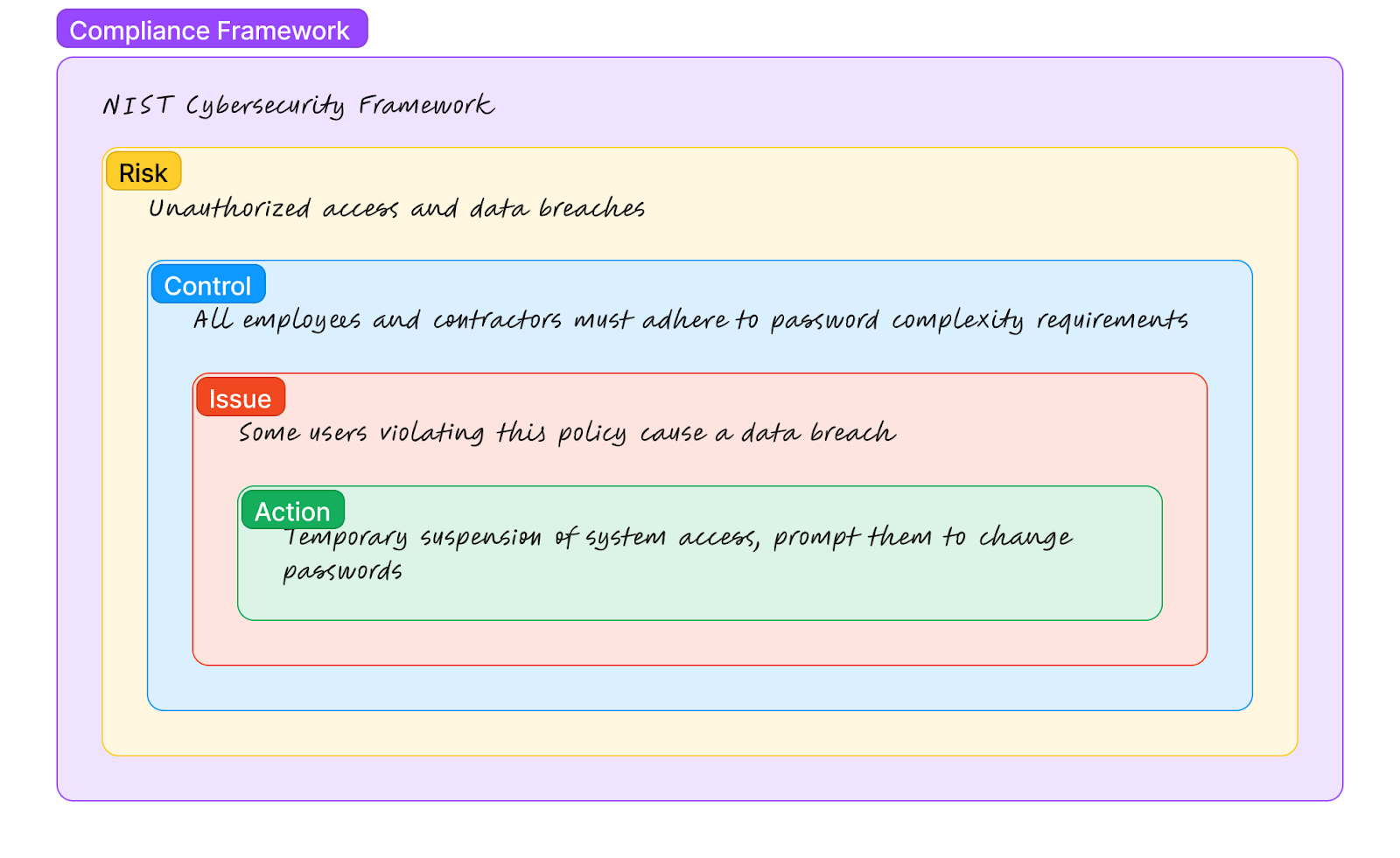
Domain Model

User Personas
Primary: Individual Contributor (IC)
- Manages controls in a compliance framework and ensures they are actually mitigating the intended risk.
Secondary: Decision-Maker
- Tries to strike a balance between managing risks effectively and achieving organizational goals.
- Navigates uncertainties, makes informed choices, and enhances their resilience in the face of potential challenges.
For most of the beta, we were focused on improving the IC workflow (since they had more immediate day-to-day pains), and we focused on the decision-maker afterwards.
proof of concept
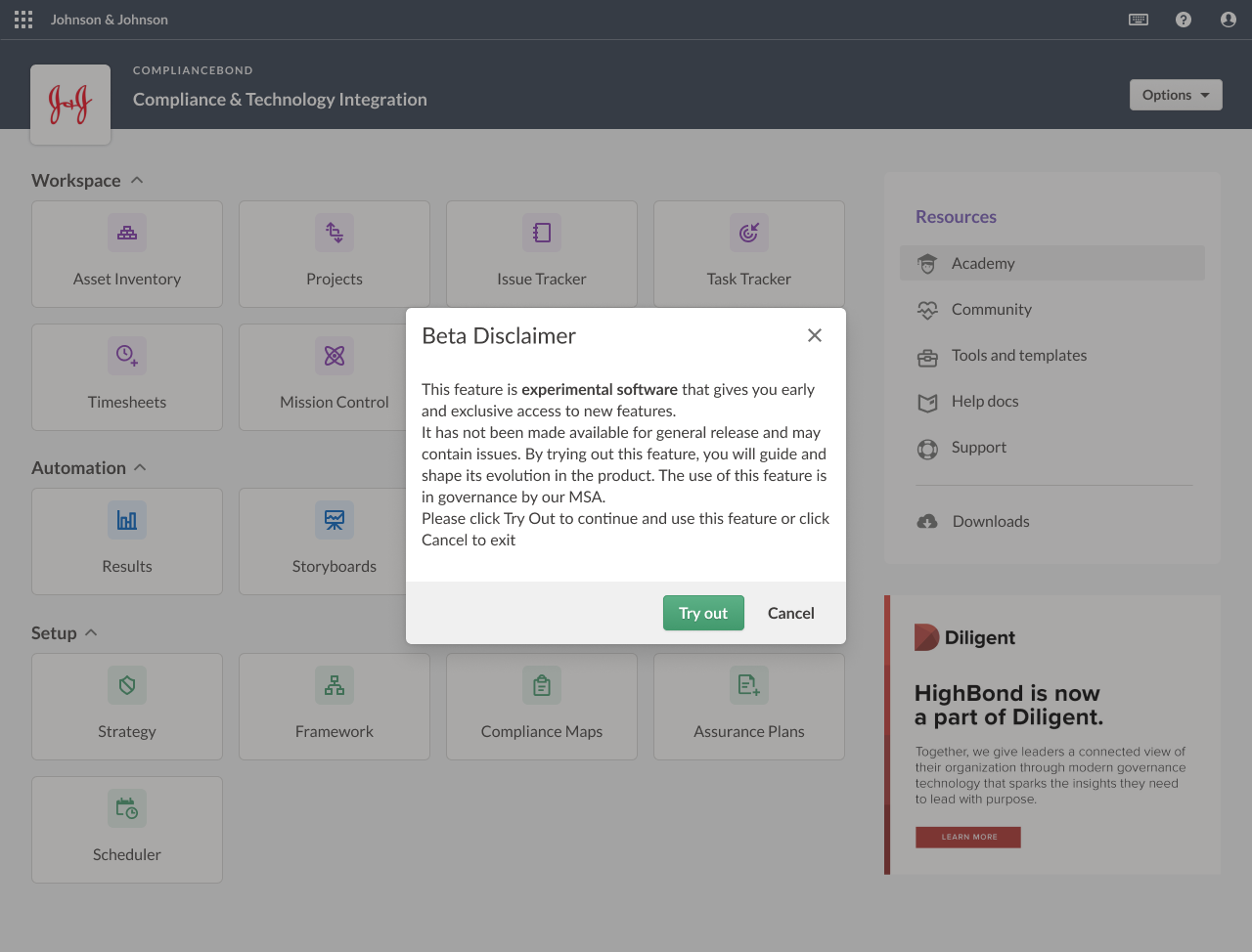
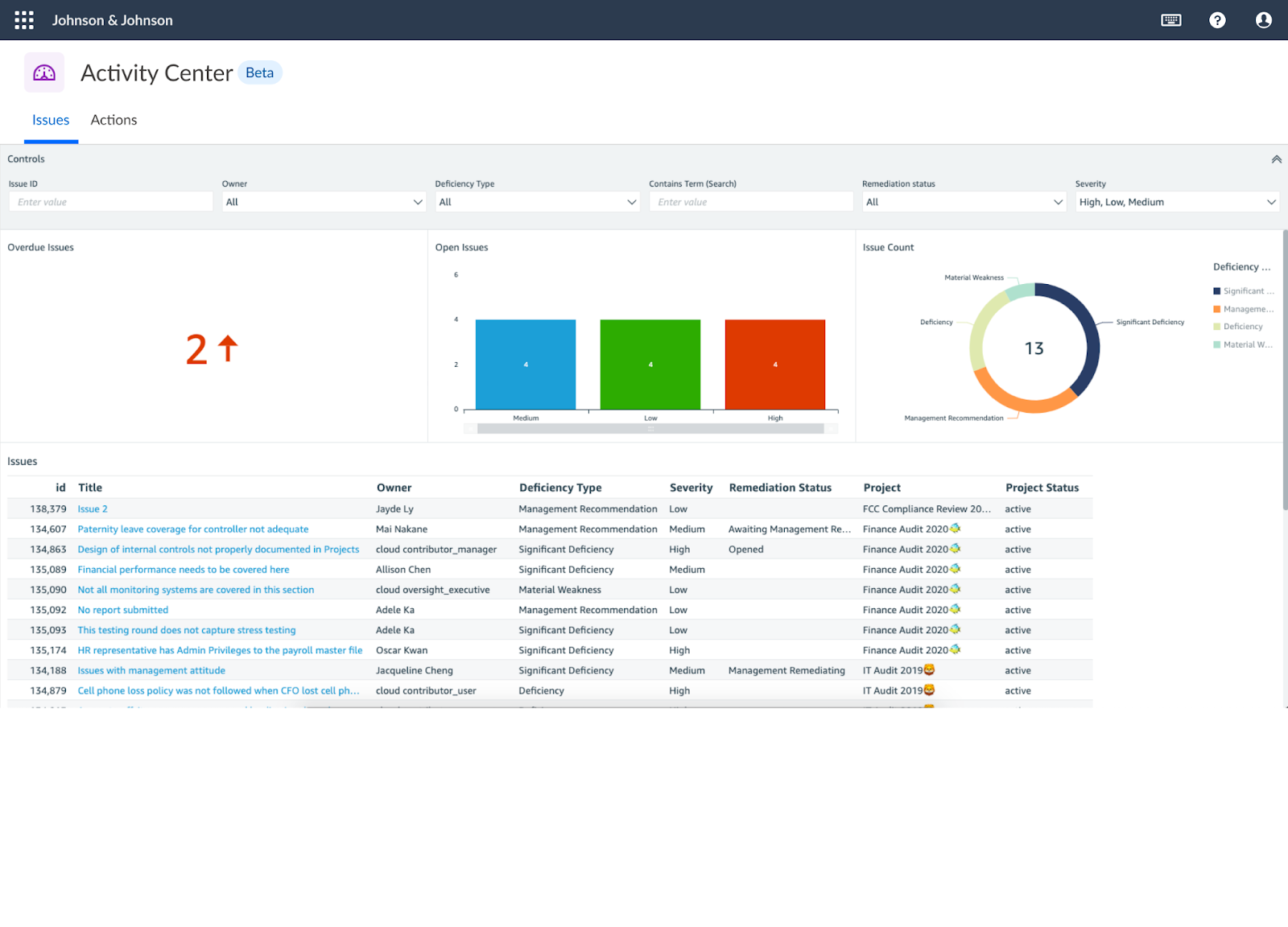
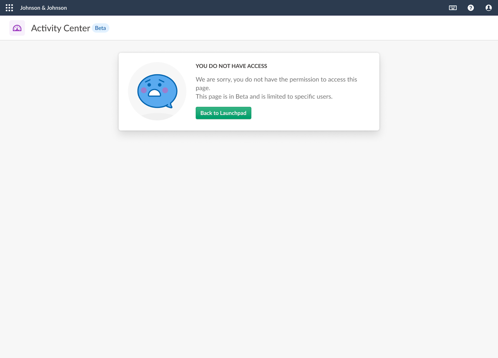
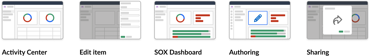
Beta Release 1: What was included?
- Showcased potential capabilities of QuickSight in HighBond in new Activity Center app.
- Included opt-in or out for beta customer recruitment.
- Set up Pendo to target list of beta users to monitor usage and adoption of new features as we shipped more features in beta.
authoring
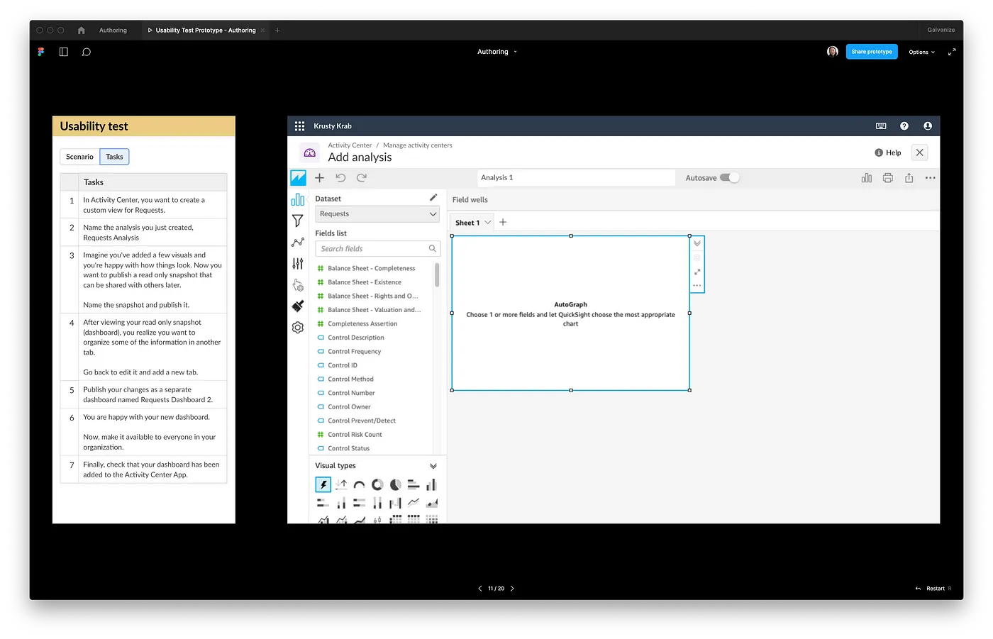
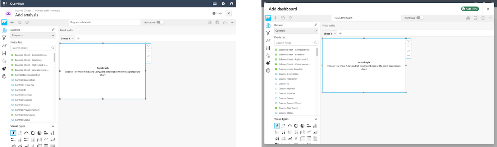
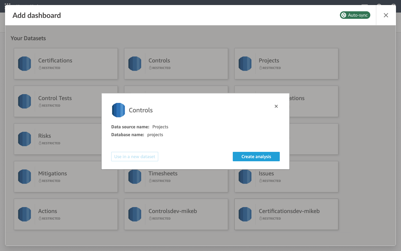
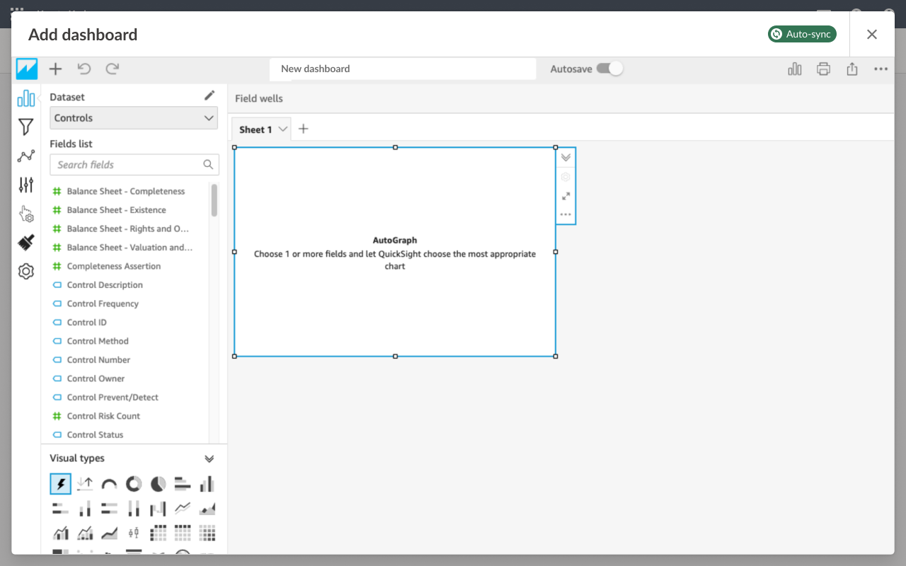
After the first beta release, we were confident that datasets from HighBond could be pulled into QuickSight quite easily. For the next iteration, we wanted to allow users to create their own dashboards in a feature called Authoring.
Usability Test
Before we could allow for custom dashboard creation, we did some usability tests on the Authoring design. After our initial look at QuickSight for the PoC, we could foresee a lot of issues already, but we wanted to confirm this with data to see if our assumptions were correct. We uncovered some technical constraints that we thought may be confusing to users that we shared with the team:
- Moving between HighBond screens and QuickSight iFrame
- Product Terminology: Activity Center, Dashboard, Analysis (What does each mean?)
- QuickSight allowed for multiple dashboards to be created from one analysis
- Managing permissions by restricting sharing to be available in HighBond only
Participants: 6 Users familiar with legacy Reports app (Mix of customers and internal staff)
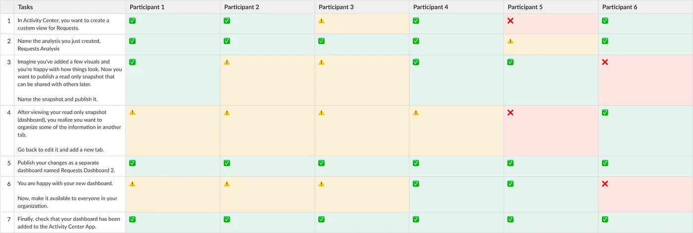
Design Remediations
1/6 participants used the “Help” button
- Moved help content into an empty page placeholder for discoverability
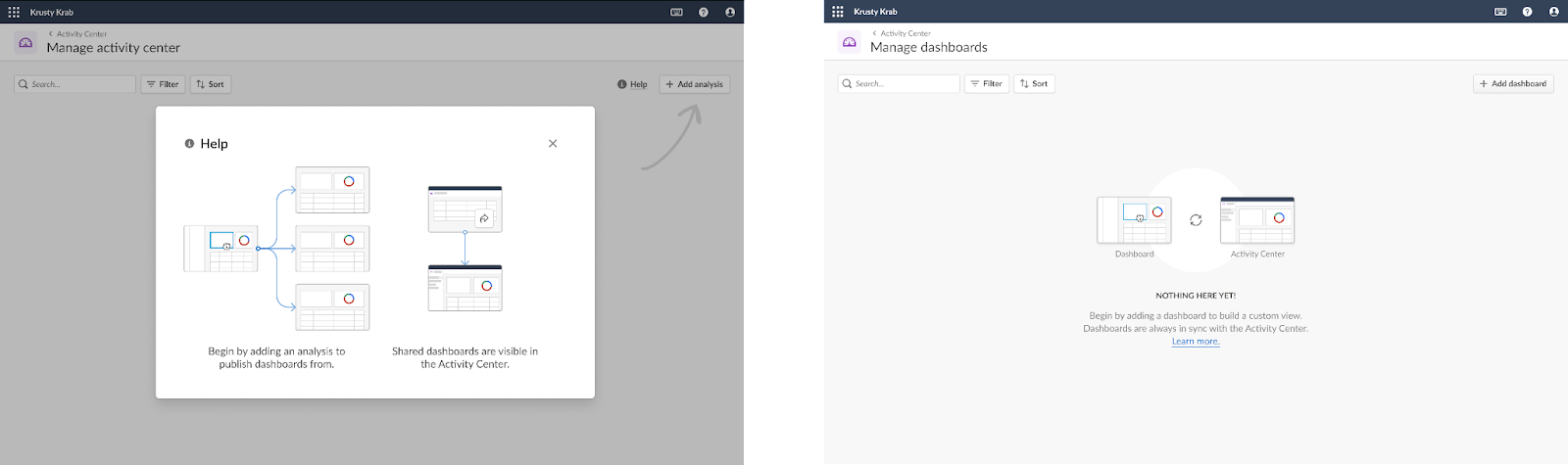
4/6 participants struggled going between HighBond and the embedded QuickSight screens
- Moved dashboard creation process into a full page modal (Takeover) to ‘contain’ editing process for focus and ‘drop off’ user back in Activity Center module.
- Clarified Language: Manage activity center → Manager dashboards
- Clarified Language: Add analysis → Add dashboard
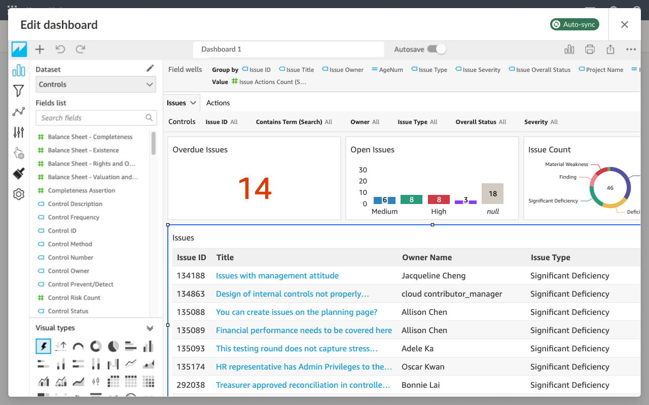
Theming QuickSight
We created a Diligent QuickSight theme to be used by engineers to apply to new dashboards that will be built to follow the same color scheme as HighBond
Step-by-step guidelines was written in confluence to give guidance on how visualizations should be configured in QuickSight to best match HighBond and account for responsiveness and accessibility. This included ensuring that all visualizatinos had labels, a legend, and a minimum font size of 16px for legibility.

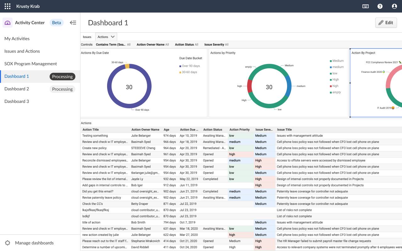
Beta Release 2: What was included?
- Ability for customers to create their own custom dashboards in the Activity Center.
- Side navigation to switch between multiple dashboards
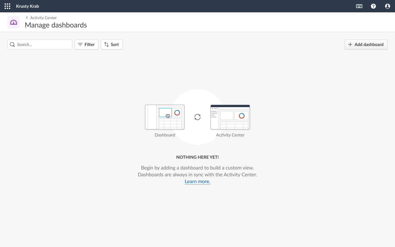
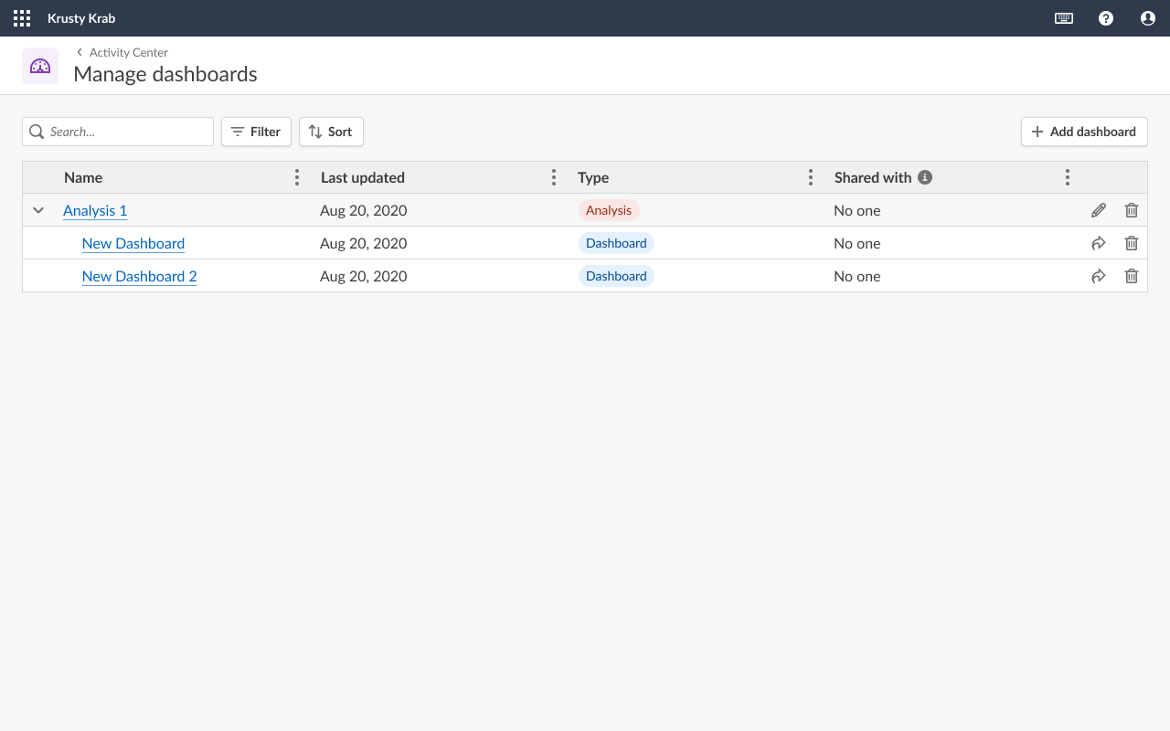
- Manage Dashboards area for those with authoring permission to edit, delete or share existing dashboards
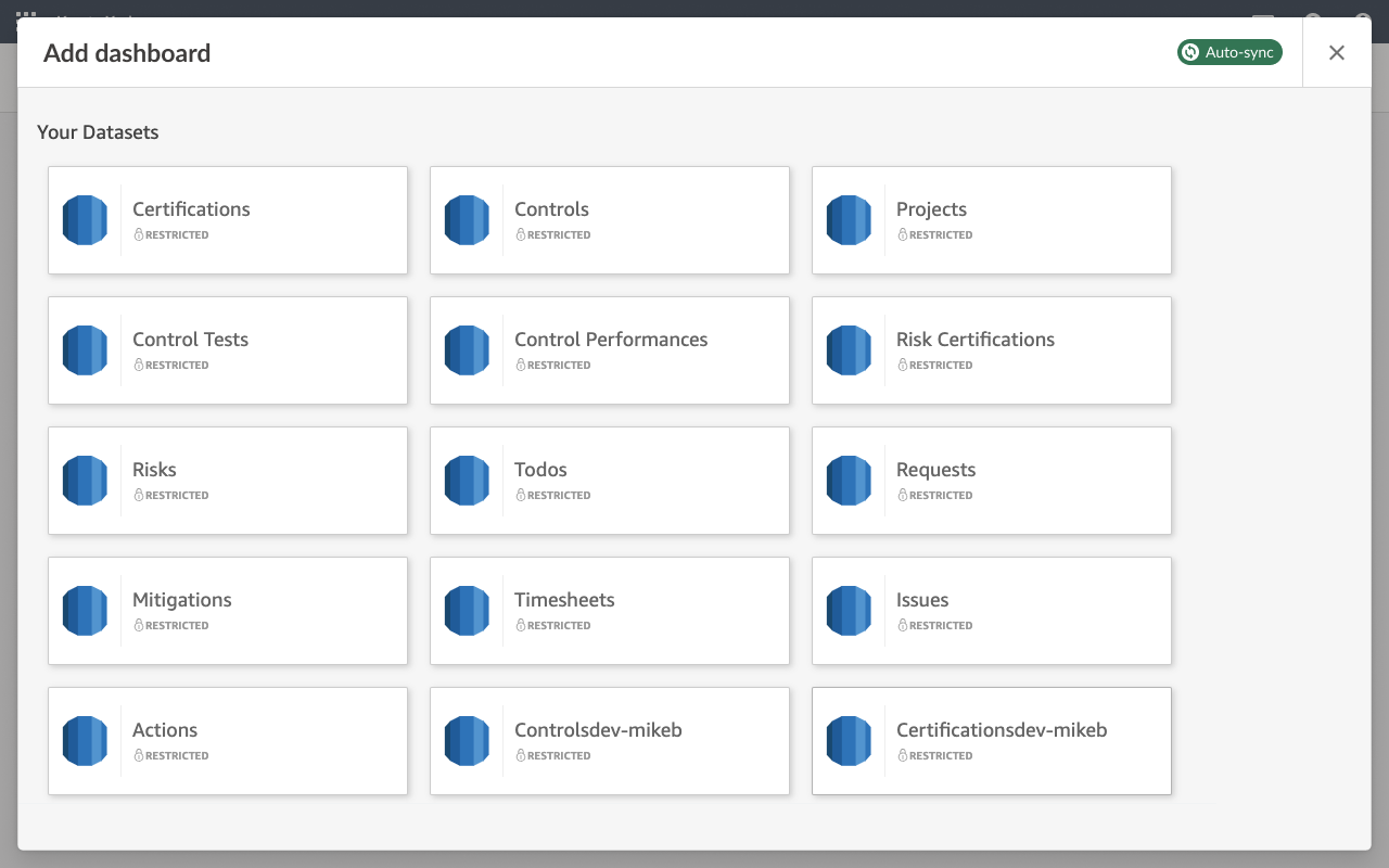
- Ability to add within the HighBond app through embedded QuickSight UI
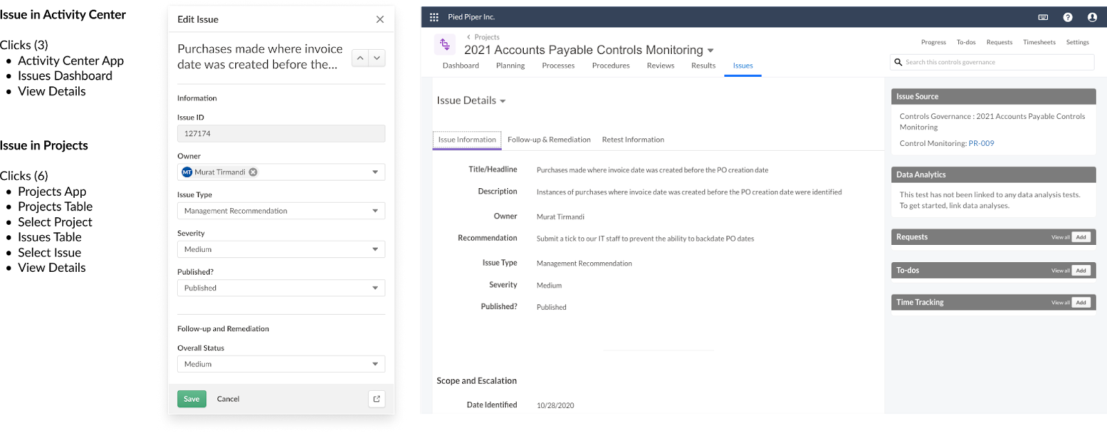
in-line detail view
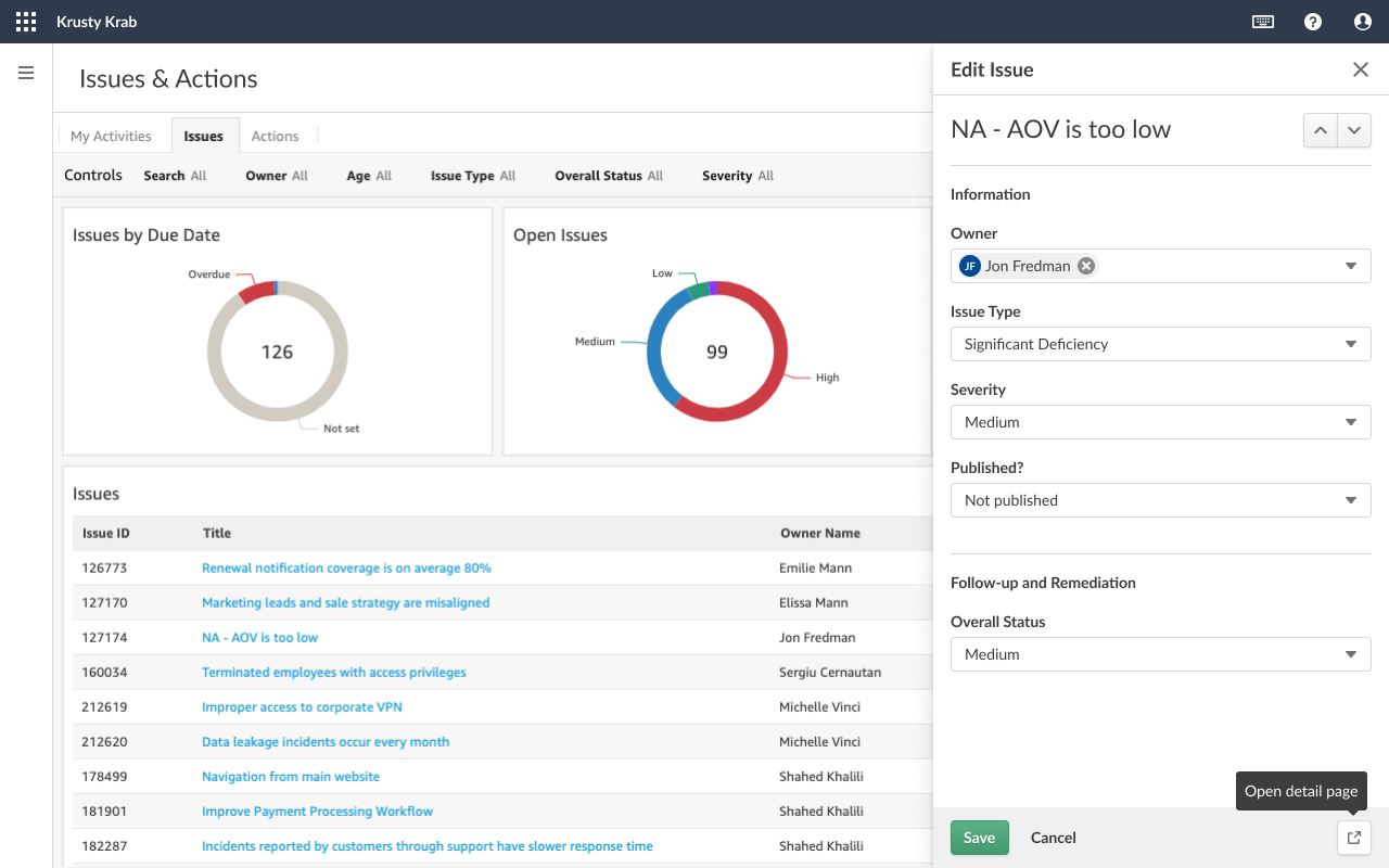
Beta Release 3: What was included?
- View object details from a dashboard table (Out of the Box Dashboards Only)
- Allows user to update statuses quickly or go directly to details page
- Different Permissions for:
- Professional User - Able to view and edit details panel
- Oversight Reviewer - No write permissions, read only version of details panel
- Contributor Tester - Only able to update issues they created themselves
- Contributor User - Only able to update issues they created themselves
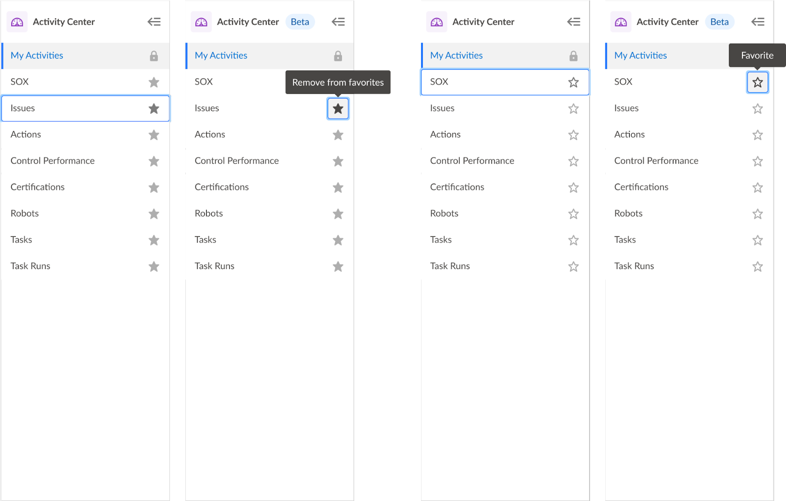
favoriting
As users began to create their own dashboards and share them with the team, we knew they would eventually need some way to organize their dashboards and navigation.
We explored possible navigation groupings:
- Grouped by App
- Grouped by Domain object by objective
- Grouped by Domain object by objective per project
- Grouped by Domain object by process per project
- Grouped by Domain object by risk category per project
- Grouped by Domain object (one object or aggregate) + Handle objective, process, risk or project grouping within the dashboard as a filter
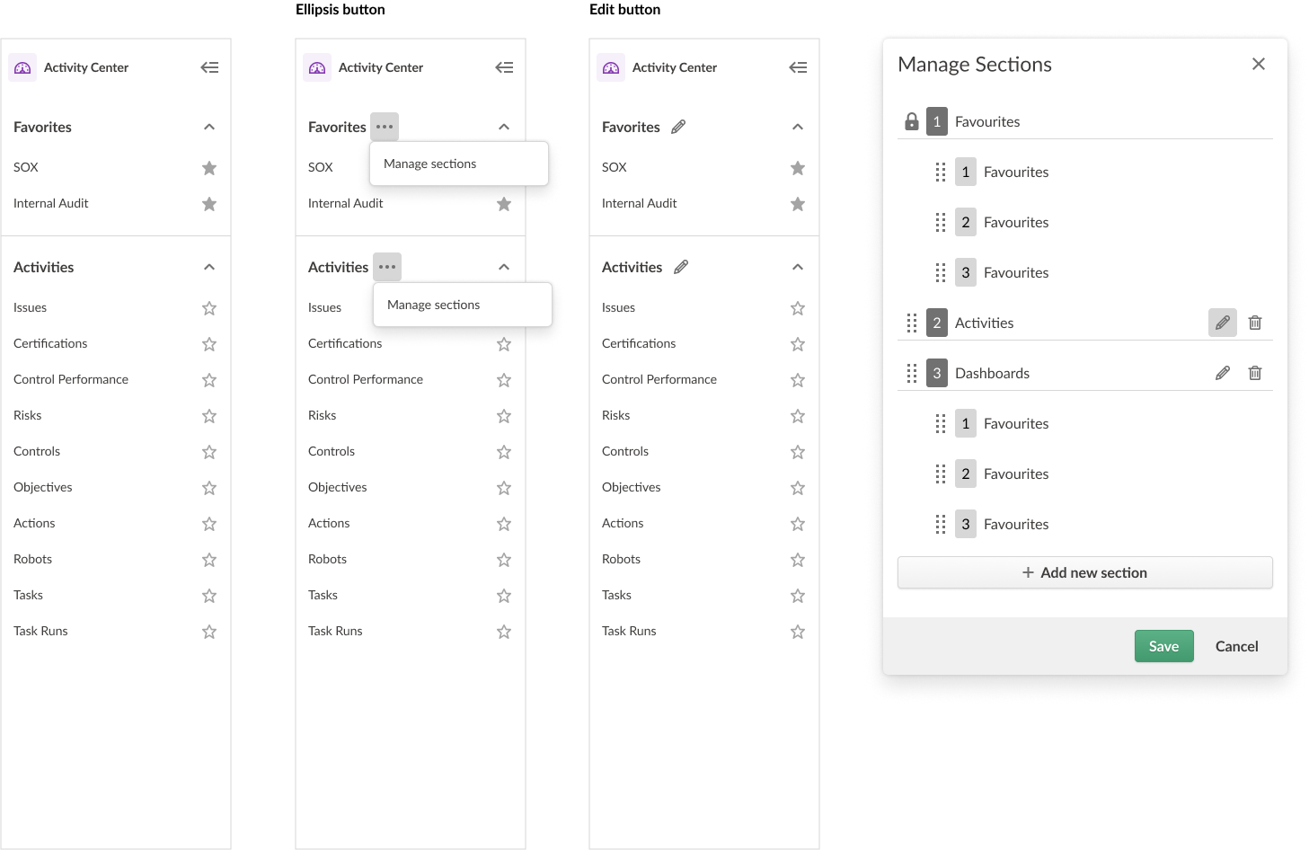
Beta Release 4: What was included?
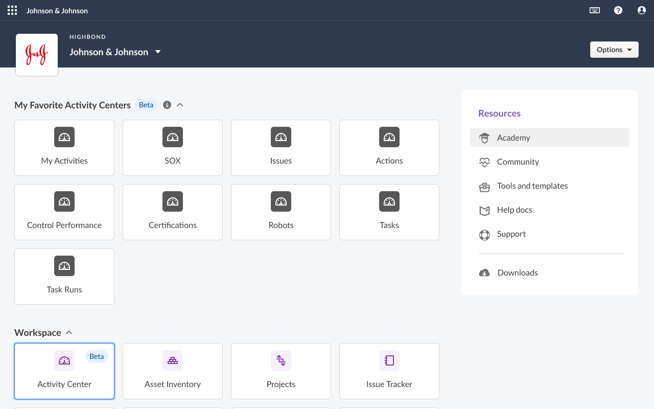
- Ability to use favorites as a way to pin certain dashboards at the top of the list
- Pinned favourites also appear as tiles within Launchpad (Exploring alternate uses for Launchpad)
illustrations
Used to explain other features as we expanded from the proof of concept (beta release 1).
challenges
- Integration Challenge:
- Integrating third-party QuickSight app seamlessly with HighBond platform.
- Making core domain data available for user reporting.
- Managing technical formatting and terminology differences.
- Permissioning and Onboarding:
- Aligning permissions by creating QuickSight accounts for HighBond users.
- Handling permissions in HighBond, and disabling QuickSight sharing.
- Users with the ability to ‘author’ needed more onboarding time.
- Localization and User Experience:
- Planning for the localization team’s turnaround time for content.
- Prioritized language consistency for power users across Quicksight and HighBond.
- Collaborating with Principal Engineers:
- Principal engineers move fast with limited code approval needed.
- Fast workflow sometimes limited design oversight.
- Maintained positive work relationship through constant communication.
next steps
- Integrate Activity Centers with Diligent Boards (App for decision-makers) so dashboards with real-time data can empower decisions instead of printed materials.
- Expand dashboard offering to other solutions: IT Risk and ESG
- Continuous monitoring of adoption and usage of new activity centers through Pendo