
📌
keela 2.0
Role: Product Designer at Keela
Date: May 2019
Industry: Non-profit fundraising
- 2 Product Designers
- 1 Product Manager
- 3 Full Stack Engineers
- 3 Machine Learning Engineers
- CEO
- Marketing Team
- Customer Success Team
- Sales Team
the challenge
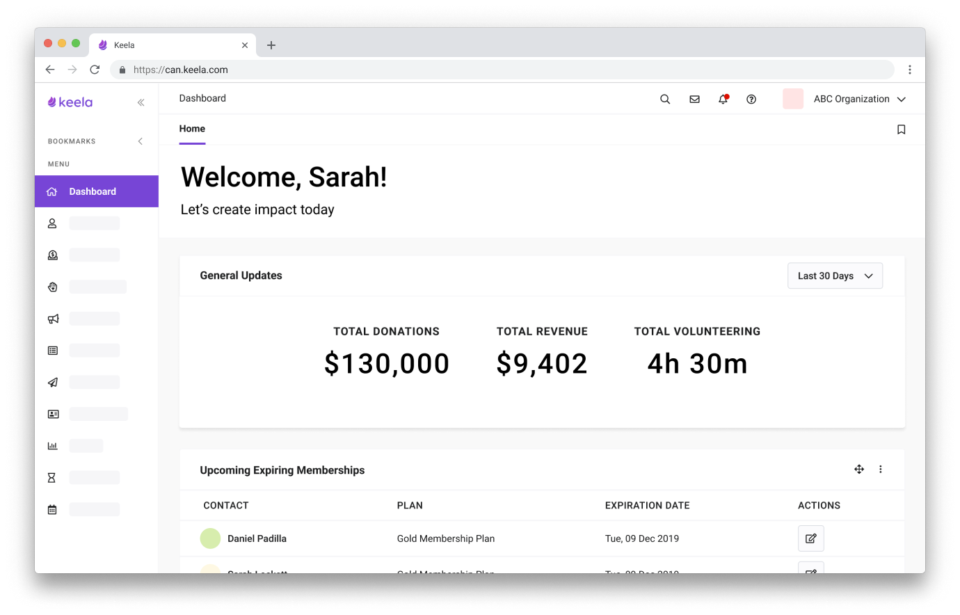
Keela 1.0 had a very robust framework for data management and analysis, but needed more attention on its information architecture and user experience. Its earlier designs were inefficient and caused scalability problems that bottlenecked the product.
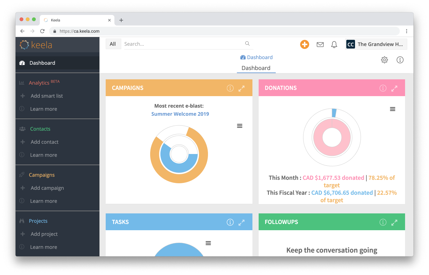
Prior to January 2019, Keela didn’t have any designers working on the product, and Keela’s engineers handled design and development. As a result, sometimes the app’s actions were disorganized, duplicated and lacked hierarchy.
Building Keela 2.0 involved a complete restructuring of the backend of the app. We also revisited each feature (there were over 20!) to improve its functionality by addressing customer pain points and ensuring that we left room for each feature to grow.
Keela 2.0 also represented a brand shift to use machine learning to digest data for non-profits that might not otherwise have access to these resources - freeing their teams up to do more good in our communities.
high level goals
- Make Keela a simple, easy to use system that just ‘makes sense’
- Increase impact by making technology more accessible to non-profits
- Convert data into actionable insights through machine learning
research & sprints
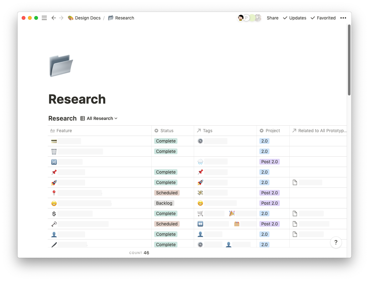
We conducted user interviews with Keela 1.0 customers to understand use cases more deeply and shared this anecdotal evidence with the team for more context. Our findings are summarized on notion and shared widely for feedback.
For features that have been a part of the product for a long time, we also analysed our zendesk tickets to understand recurring customer pain points.
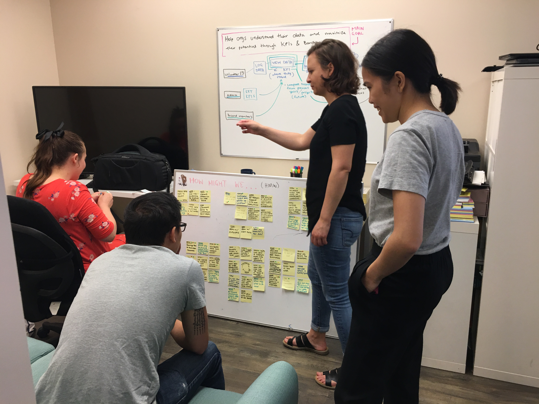
After reworking Keela's foundational features, we moved into uncharted territory - ideating on how to enhance existing tools and expand the number of features we offer as well. We worked through these big unknowns collaboratively through design sprints.
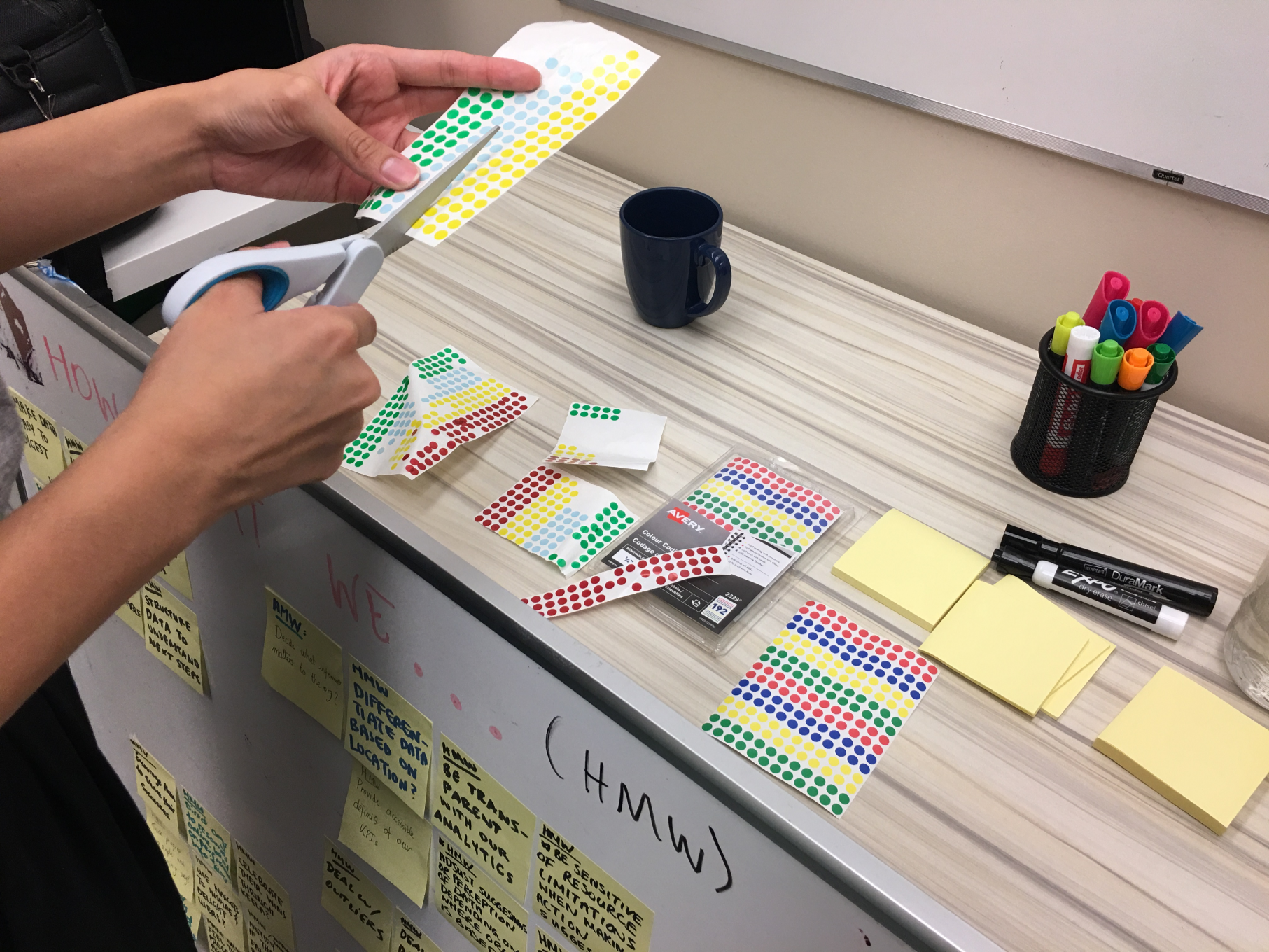
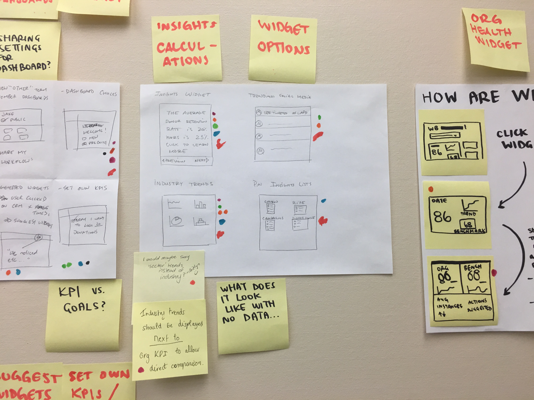
These sprints allowed us to create space for crazy ideas and empowered all teams think beyond their day-to-day silos and dream a little.
simplifying the interface - a lot
We combed through each existing feature (split up between 2 designers) and analyzed the flow of the user interface to see where we could streamline the experience for Keela 2.0. Our user demographic is aged 50+ and may struggle with using software, so it's important for us to be clear about each components' purpose.
In Keela 1.0, there were often multiple places to add the same data into Keela, but with different behaviors at each location.
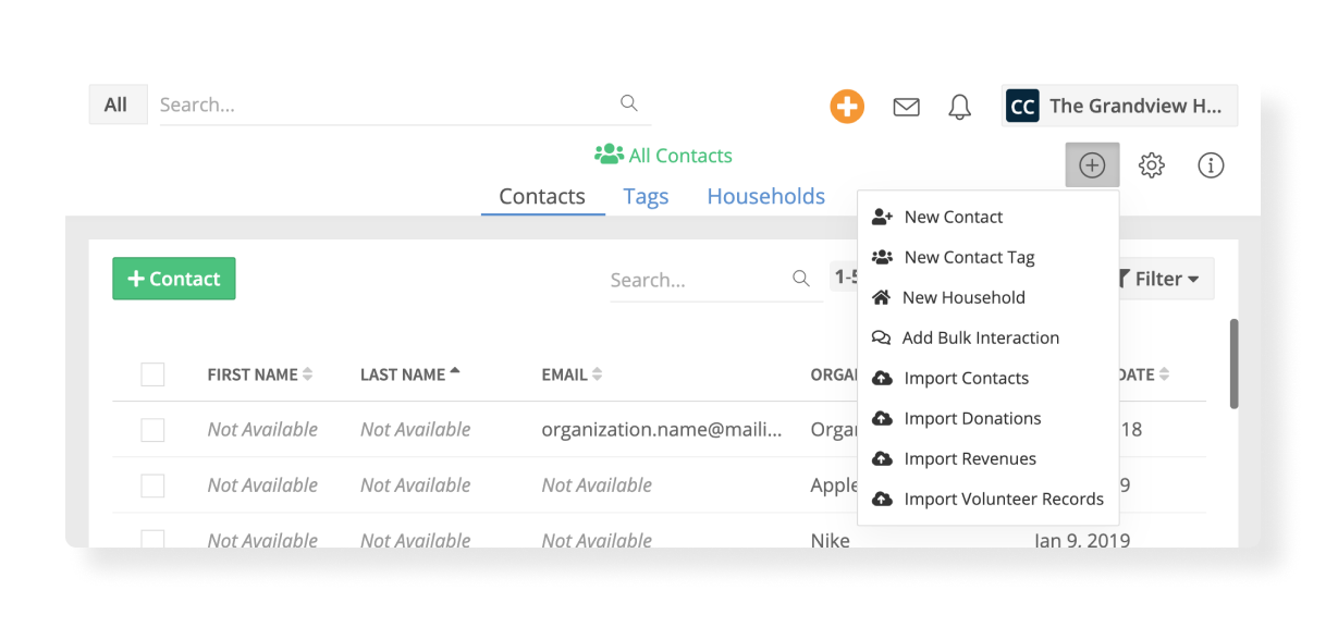
In Keela 2.0, we introduced a purple primary action button on each page to keep things consistent and make it easy for our users to add data to their CRM.

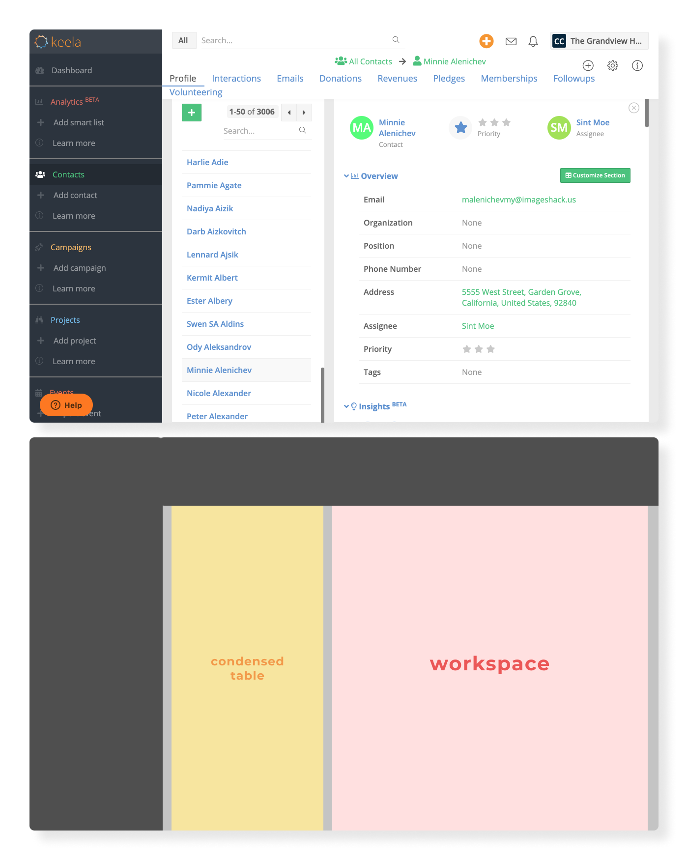
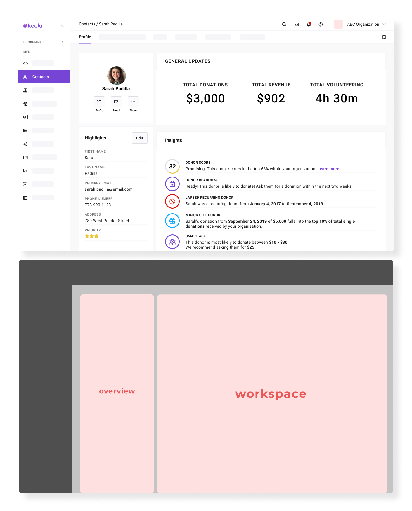
Keela 1.0 didn't utilize the available viewport very well. For a CRM where data is constantly being reviewed, we wanted to make space (literally) for our users to focus on their work. We were restricted by the UI framework and needed to adhere to a similar skeleton as Keela 1.0. As a result, instead of showing the condensed table as in 1.0 (yellow area), in Keela 2.0, we utilized this space to show an overview of the current data being reviewed. This utilized the viewport more effectively by using the full page area to display resource details.
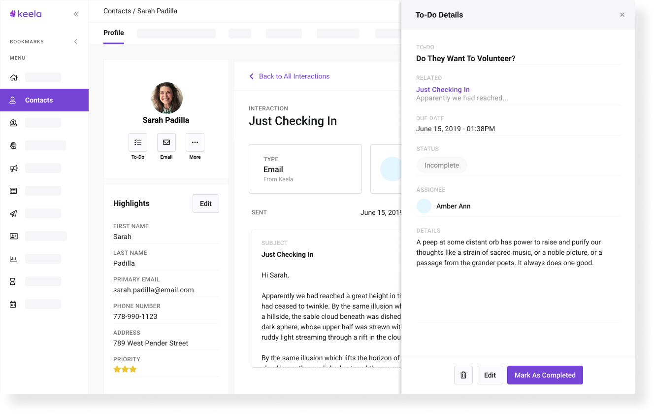
We also introduced a new preview component to Keela 2.0 where users could easily look at data details from a table without having to click into another page. This component slides in from the right and is easily dismissible.
solutions for non-profits
Aside from overall UX/UI changes, we built a suite of tools designed to decrease the amount of time non-profits spend on administrative tasks, automate workflows, and increase the time spent in their communities doing impactful work.
design system
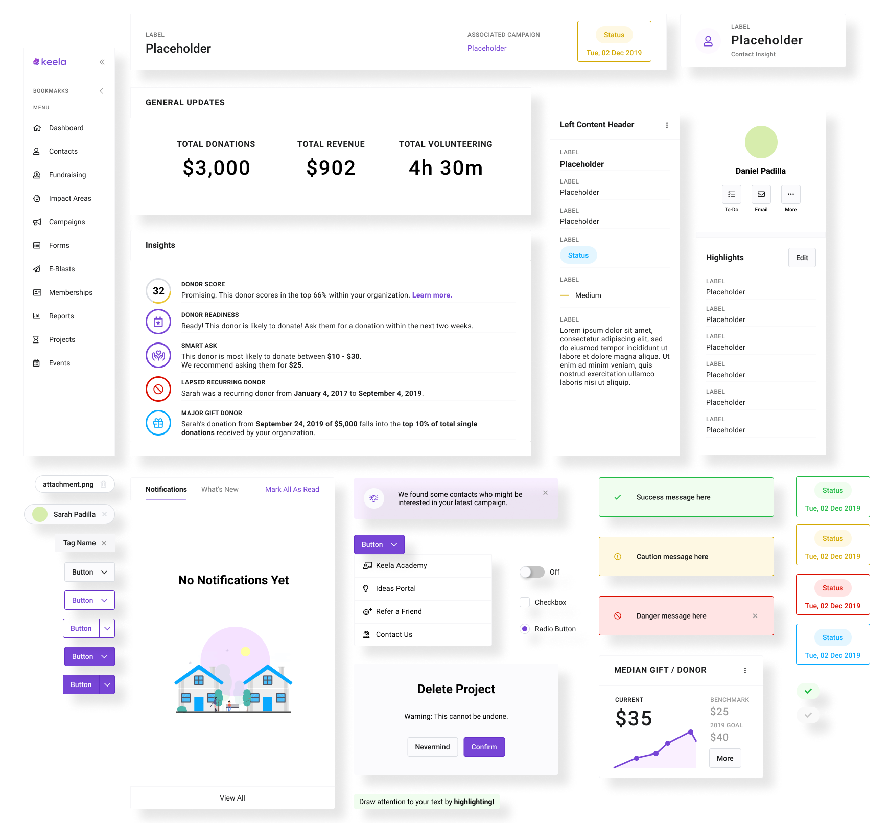
When I joined Keela, the design team became a team of 2. Although we had a UI foundation, we had no source of truth. Looking for clarity between the components our developers were using and the components I saw in our design files, I proposed that we start a design system. This implementation proved to be highly effective for keeping our prototypes consistent and getting on the same page with our engineering team.
rebranding keela
As a 'fun' side project for Keela 2.0, I was asked to tackle the company's rebranding. As a fresh grad, I was extremely humbled, and excited to be given this opportunity. I know how much the team identified with the old Keela brand and its values so I didn't take this task lightly.
After some team discussions, I discovered that Keela 1.0 was meant to be a collaborative brand that invited organizations to grow together and build capacity in their communities.
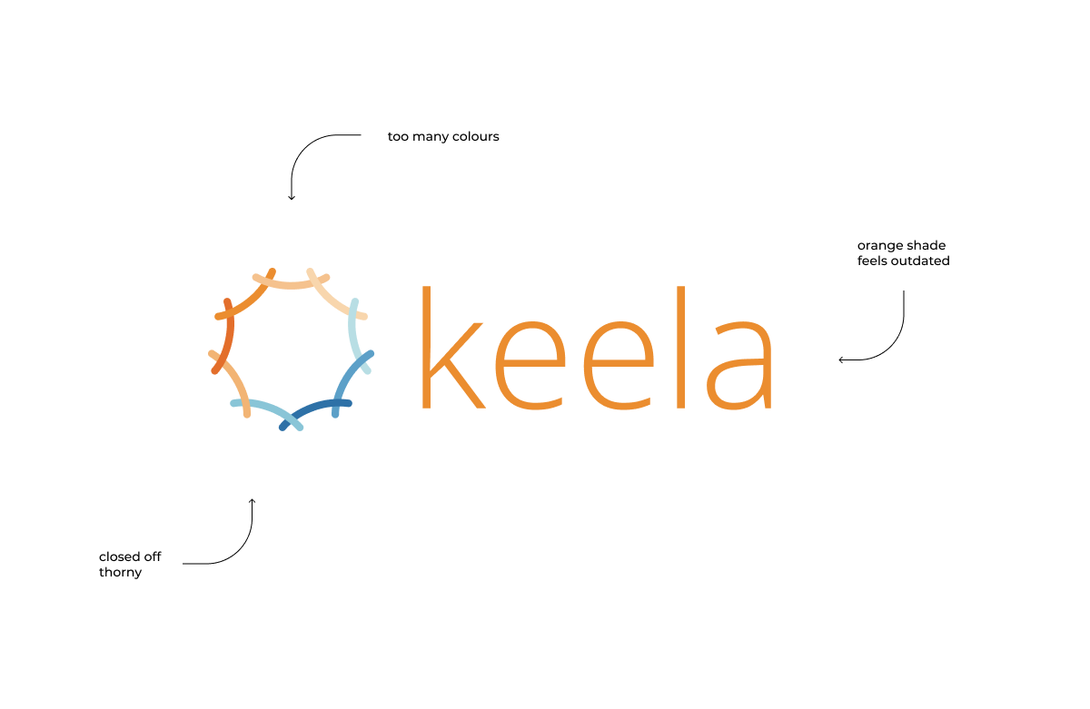
There were multiple problems with the old logo including:
- too many colours, making printing expensive
- hard to combine with different marketing assets
- interpreted as closed off and thorny vs open/collaborative
- lack of internal policing to maintain uniform usage
The transition we made with the release of Keela 2.0 was to move into a mentorship role for the industry. We want to bridge the technology gap faced by non-profit organizations in a way that is accessible, friendly and smart. Keela 2.0's new suite of features designed to help organizations dramatically decrease the time they spend on administrative work.
However, the nature of our company situates us in two worlds (the traditional, slow-moving non-profit sphere vs. the fast-paced, ever-changing tech world) as we try to bridge the gap. Representing this duality in Keela's new logo was the biggest design challenge.
I started off with some keyword mapping to invoke some imagery.

These words guided my process as I started to sketch out different options on paper.
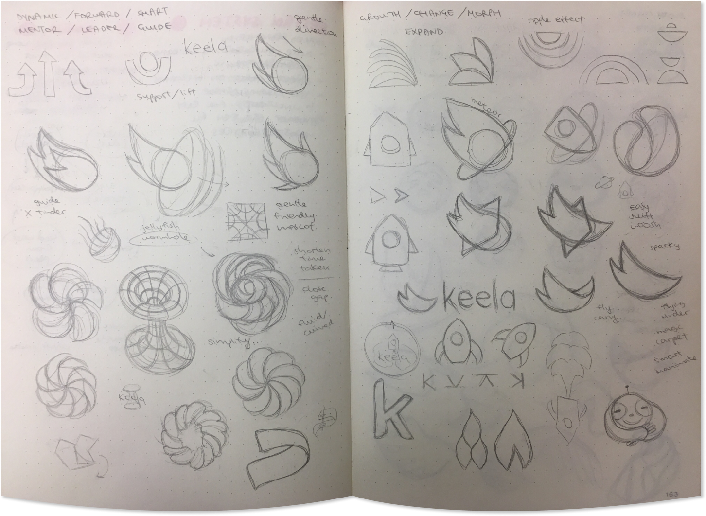
After a while, I ended up taking it onto my computer to refine.

From this process, I chose 3 possible logo directions to share
with the company and gather feedback on.
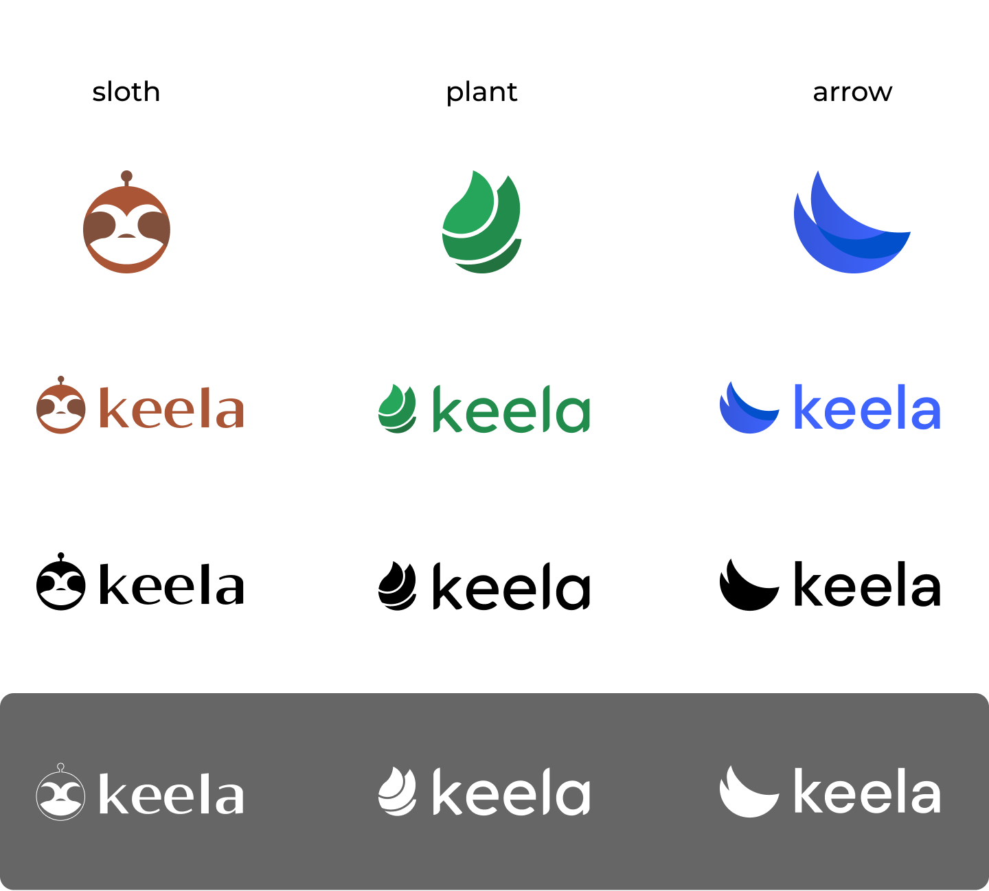
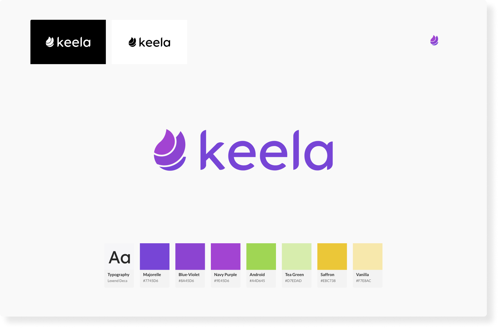
As you already saw, we ended up going with the plant logo. The expanding foliage represents dynamic growth and the botanical theme relates to the wisdom of nature, strong roots, sustaining life around it and always adapting. After many discussions though, we changed the colour scheme to purple - a colour associated with nobility, ambition, creativity, wisdom, devotion, peace, mystery, and magic. I felt it was suitable for Keela 2.0 as we guide our customers into uncharted waters and show them what can be done with data (— it's pretty magical). Our legal team had this logo officially trademarked as the 'magic bean' later on.
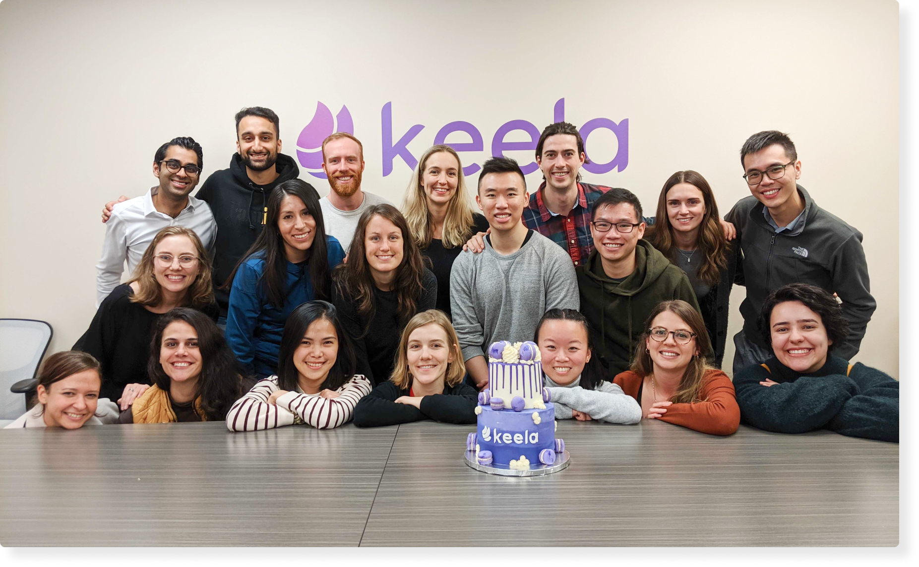
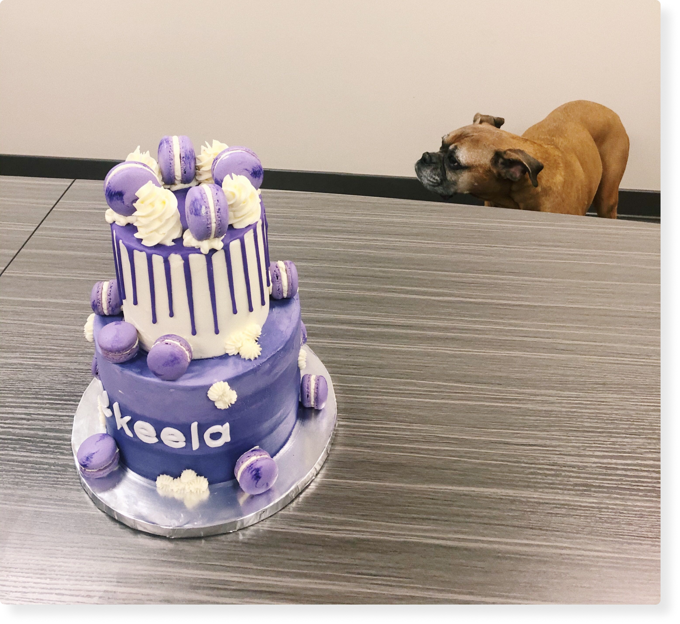
We celebrated our rebrand with cake! 💜
Maddie 🐶 was also present.
reflections
building useful features vs shiny features
As a new designer, I had to learn how to push back and question developer and business decisions in favour of solutions that would benefit our users. Instead of saying “yes” to every seemingly important detail, I’ve learned to pare down and break up features and enhancements into different releases. Managing expectations with our CEO and sales team is equally important to ensure that we can ship product releases on time.
collaborating with developers
We’ve all heard it many times before: “share often, share early”. I quickly learned to not get too attached to any of my designs and embrace iteration. The collaboration between designers and developers makes for a more robust solution in the end and is one of my favourite parts of the job.
insights from the sales & success team
As front-line team members engaging with prospects and customers daily, the sales and success teams are often our eyes and ears on the ground. Their feedback is invaluable and I find myself pulling them into many product conversations for a second opinion or gut check. They also serve as a final check for what has been prototyped before our prototypes are handed off to developers.