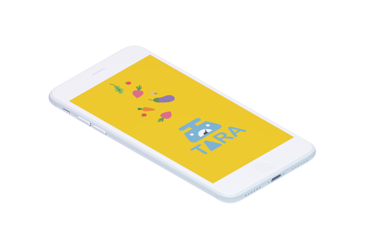
tara
type
user centered design class project
duration
september 2018 (6 weeks)
deliverables
user research
user interface, user experience
wireframing
interactive prototype
visual design
branding
the challenge
Zero waste stores are gaining popularity across the country, but there’s still a long way to go before it becomes commonplace. There are problems with affordability and accessibility, but also curiosity from consumers. Through this project, I hope to help paint the picture of a possible future where zero waste/bulk stores could operate as the new normal.
the solution
a zero waste shopping assistant
Tara is a zero waste shopping assistant that will make package free shopping more accessible to the wider public.
As part of a larger shopping experience, Tara allows users to peruse the grocery store with their containers and easily fill their containers with what they need.
Tara will unlock dispensers, record the amount customers are dispensing, and charge them appropriately.
features
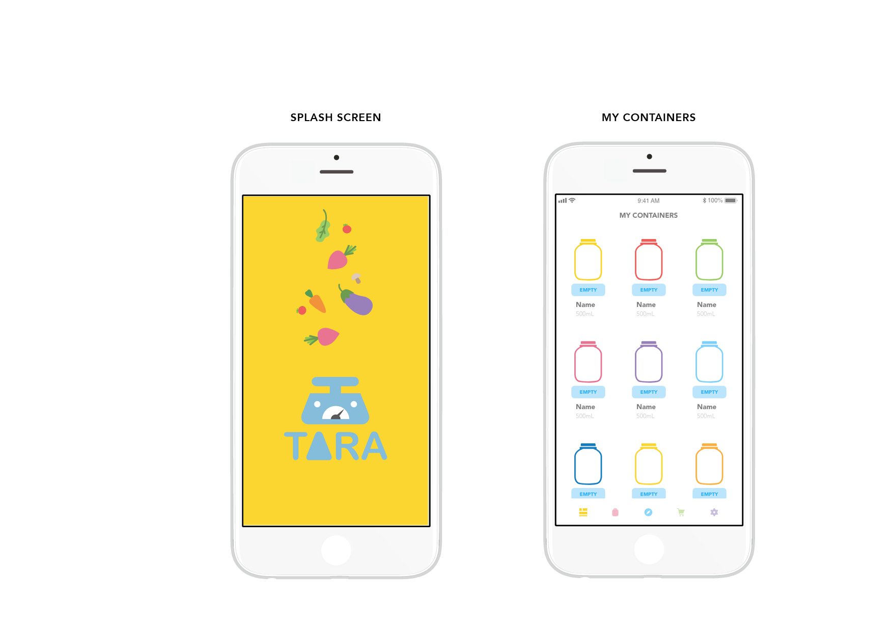
The container screen is a place for users to keep track of the items refilled in their containers and what containers they have available to purchase new products in. The container volume inputted on this page will be used for price estimates before the user decides to actually fill up their container (to ensure that the price range is within their budget).
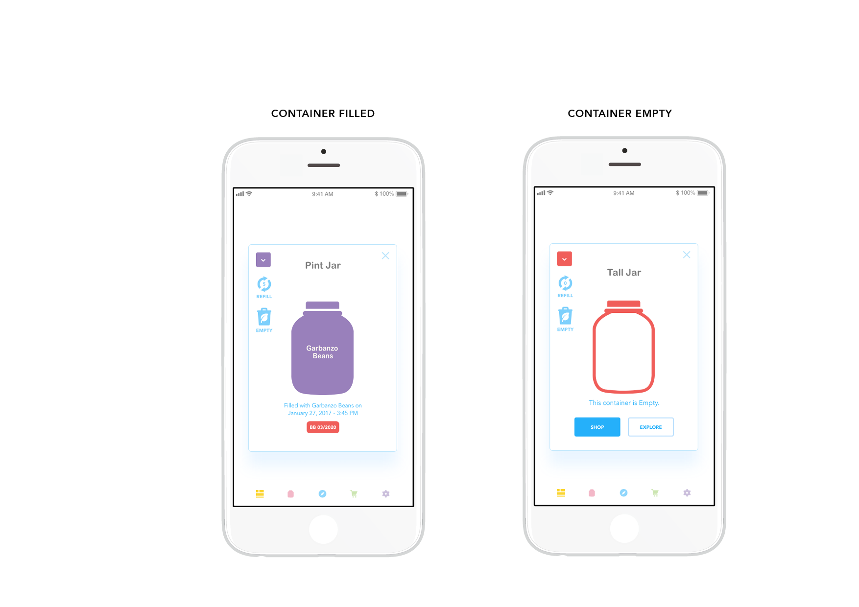
Filled containers will display product expiry dates. Empty containers prompt the user to explore the store's inventory and plan their shopping. It can also be a quick way to select containers in-store for filling.
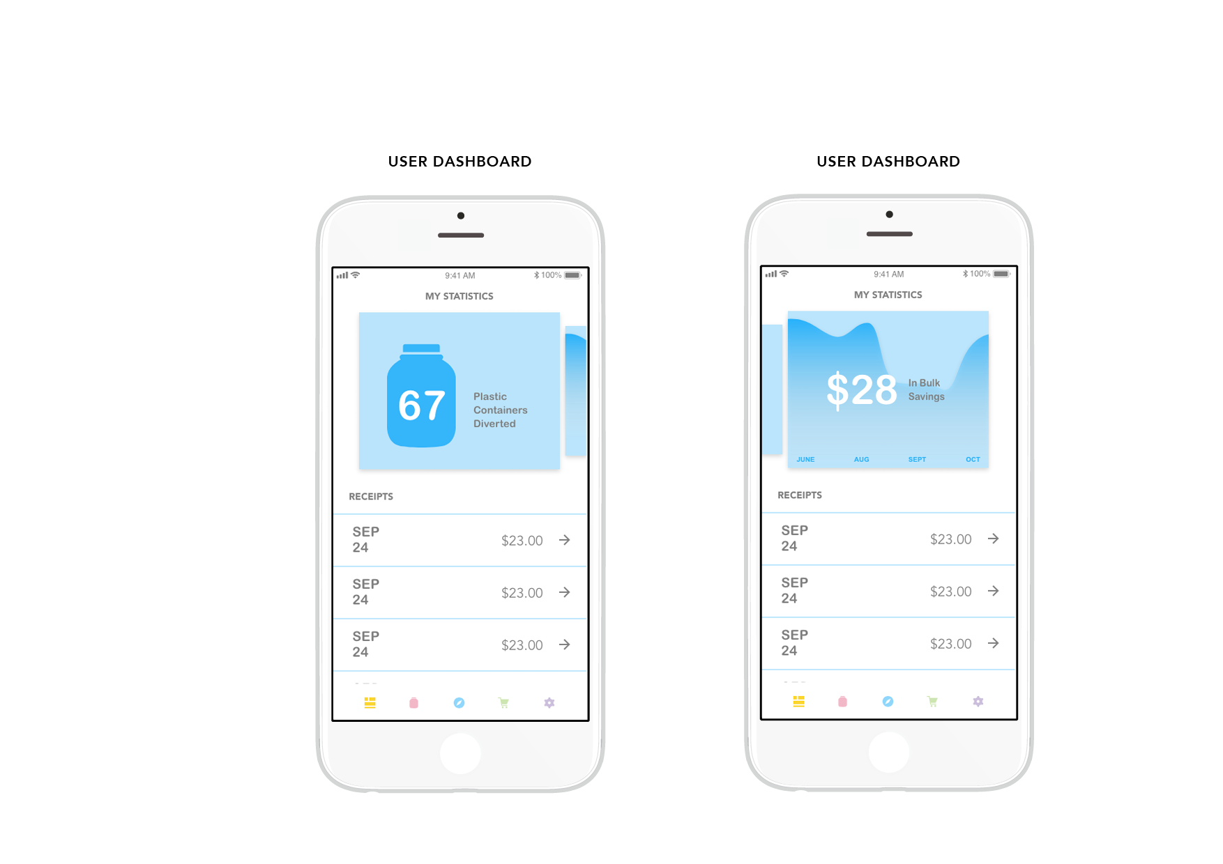
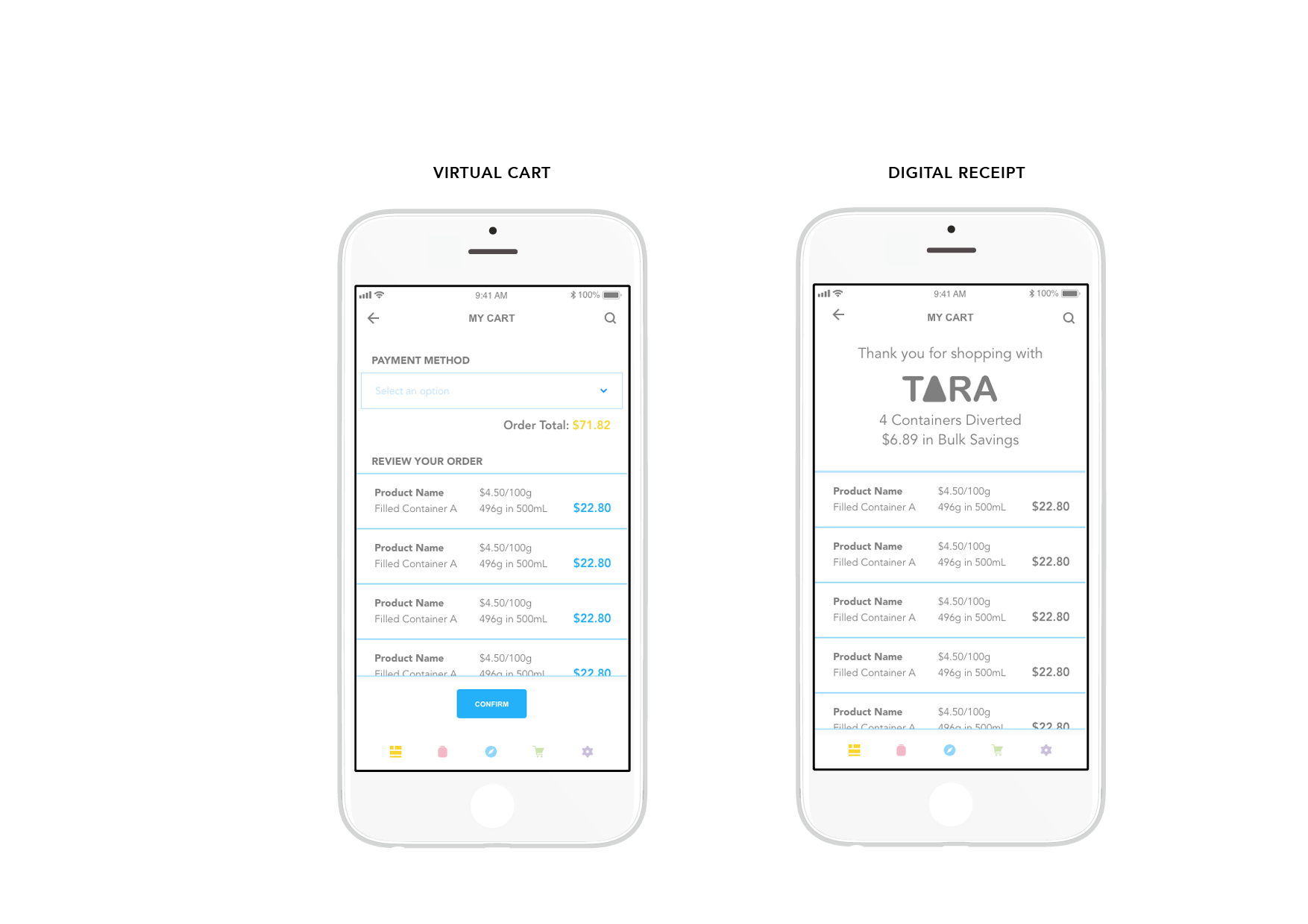
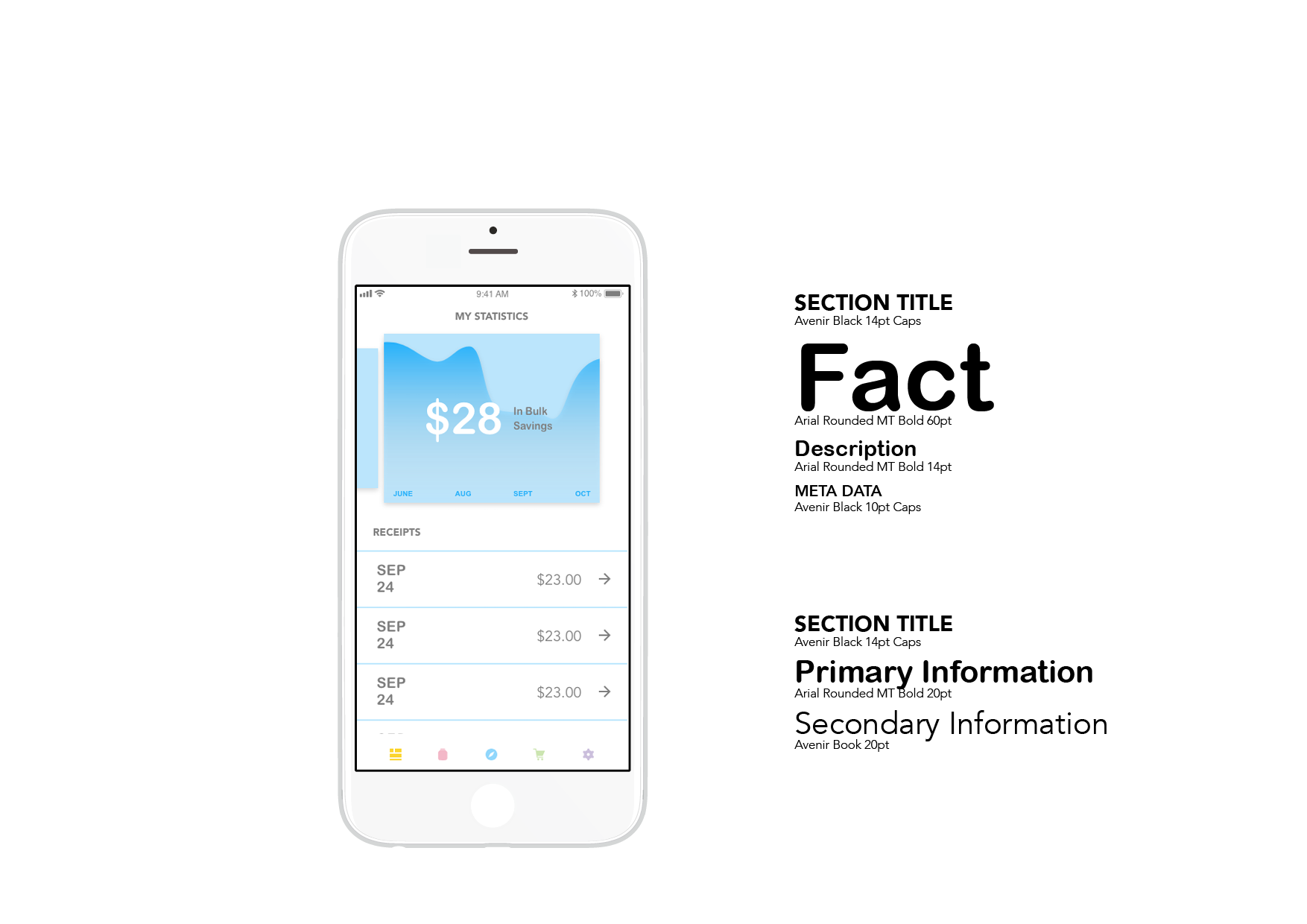
The dashboard gives users an at-a-glance look at the number of plastic containers they've diverted as well as the money they've saved by shopping in bulk. The most recent receipts can also be viewed here.
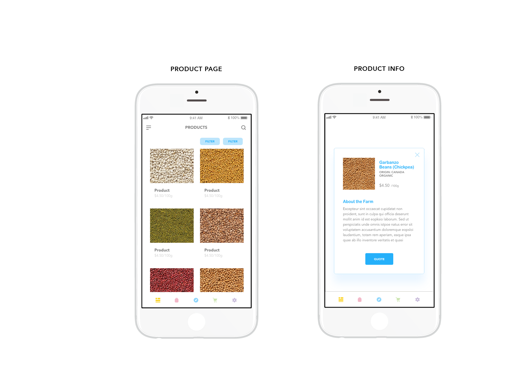
The product page allows users to browse Tara's store inventory before purchasing in store.
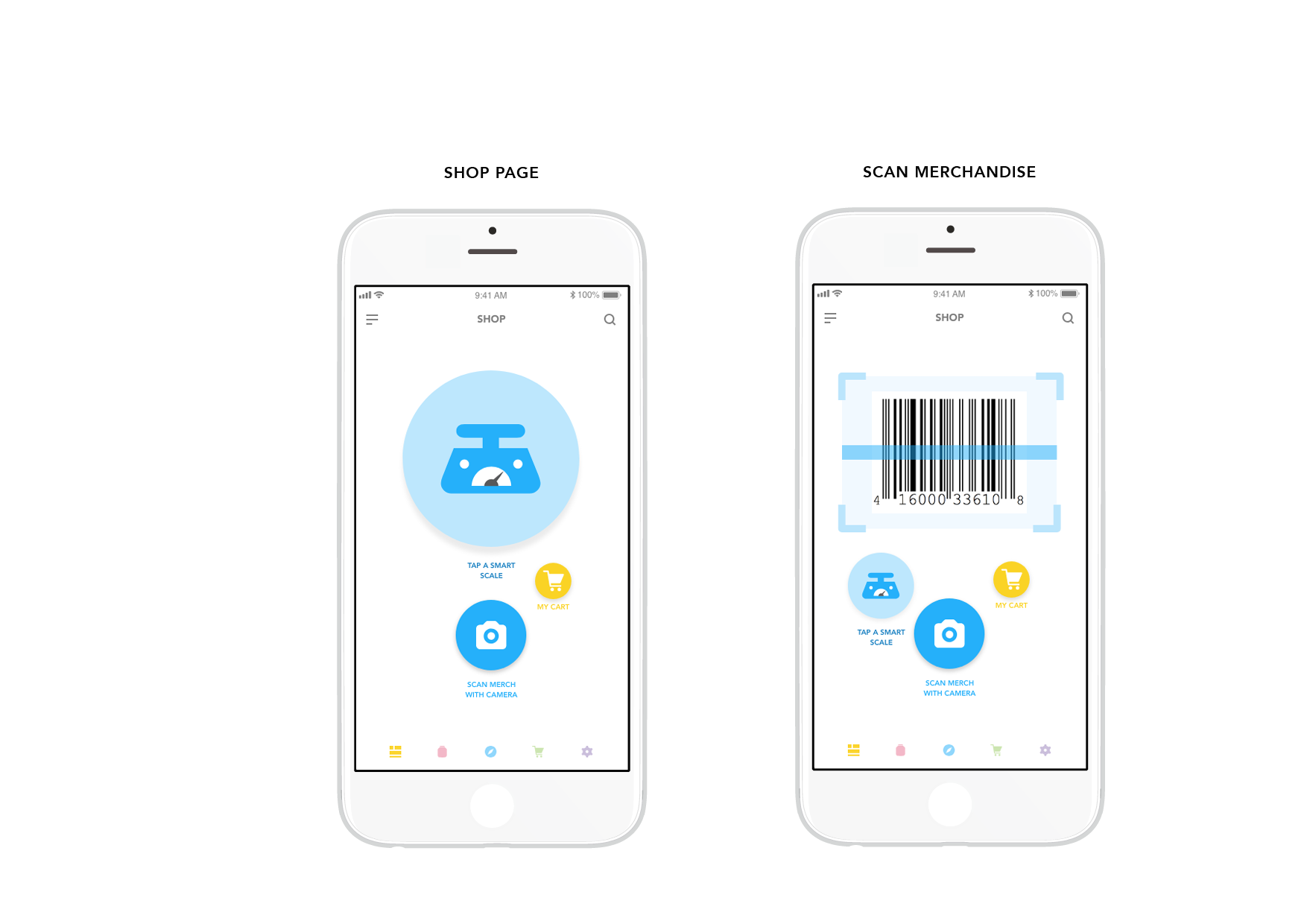
The shop features will be used in-store. Clicking the camera icon allows users to scan merchandise (non-bulk items) into their virtual cart if they opt for a self check out experience.

When smart scales contact a user's mobile device, the scale turns yellow and shows available empty containers for filling.
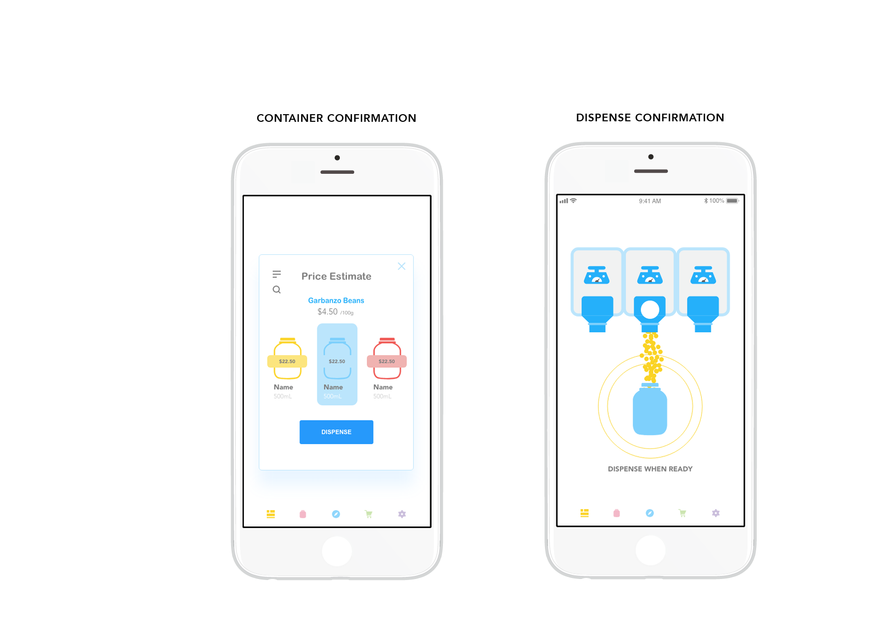
After selecting the container that they want to fill, users will be given a price estimate and then prompted to dispense from the bulk bin.
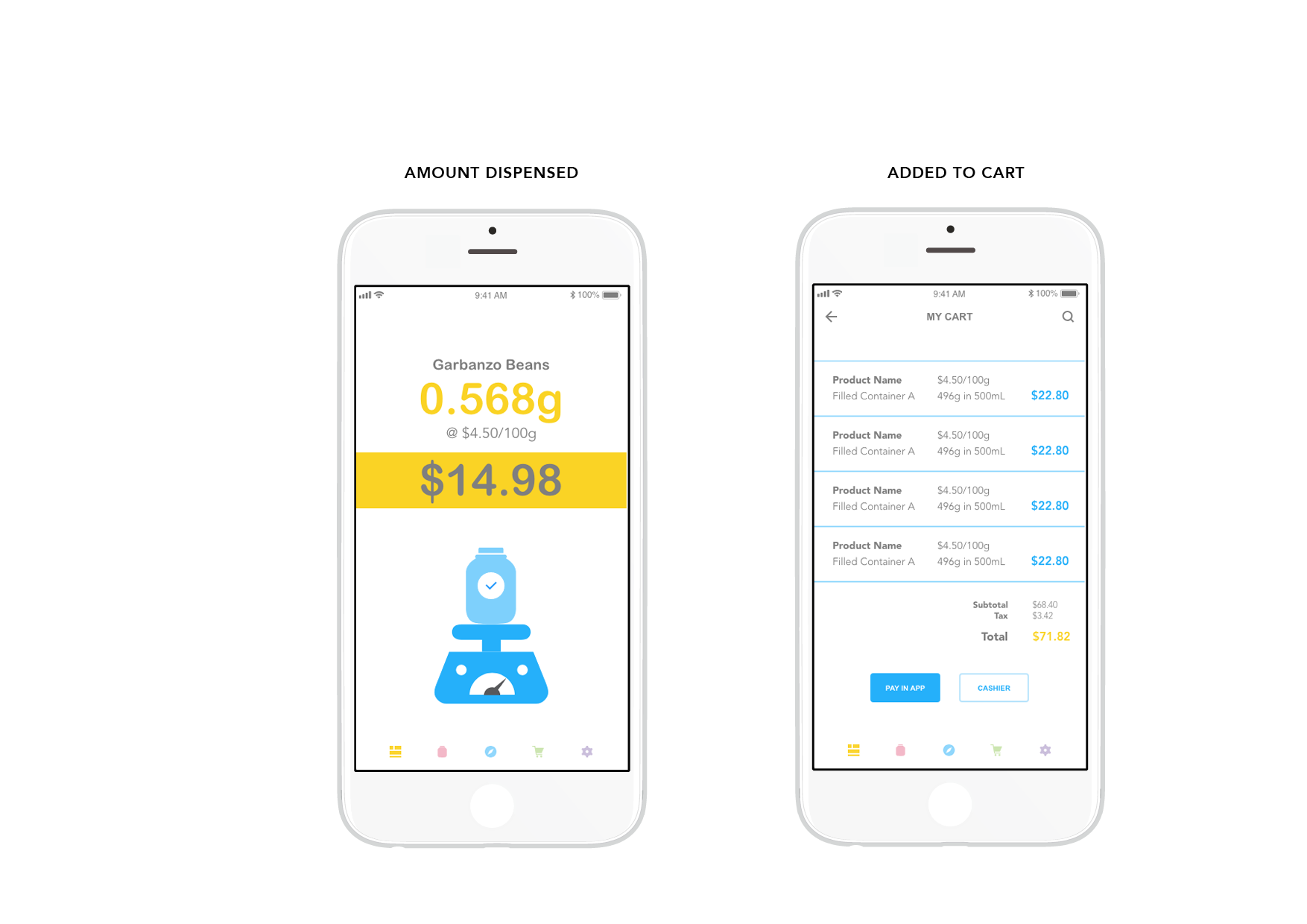
Once product has been dispensed, the amount filled will be displayed to the user and then added to their virtual cart.
the approach
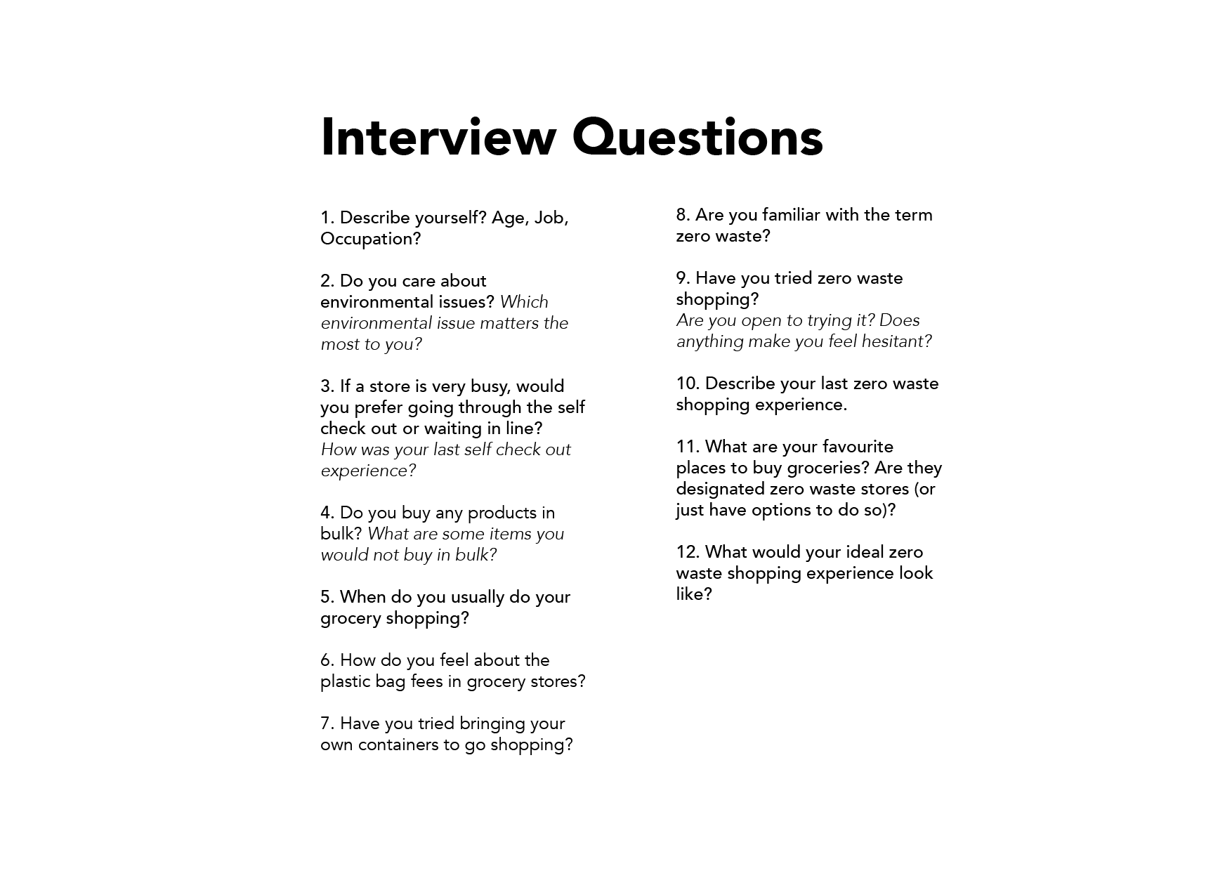
interviews
In order to understand current opinions on zero waste shopping, I interviewed and surveyed 7 people. The interviewees ranged from those who have never shopped at a zero waste store to those who regularly shop package free.
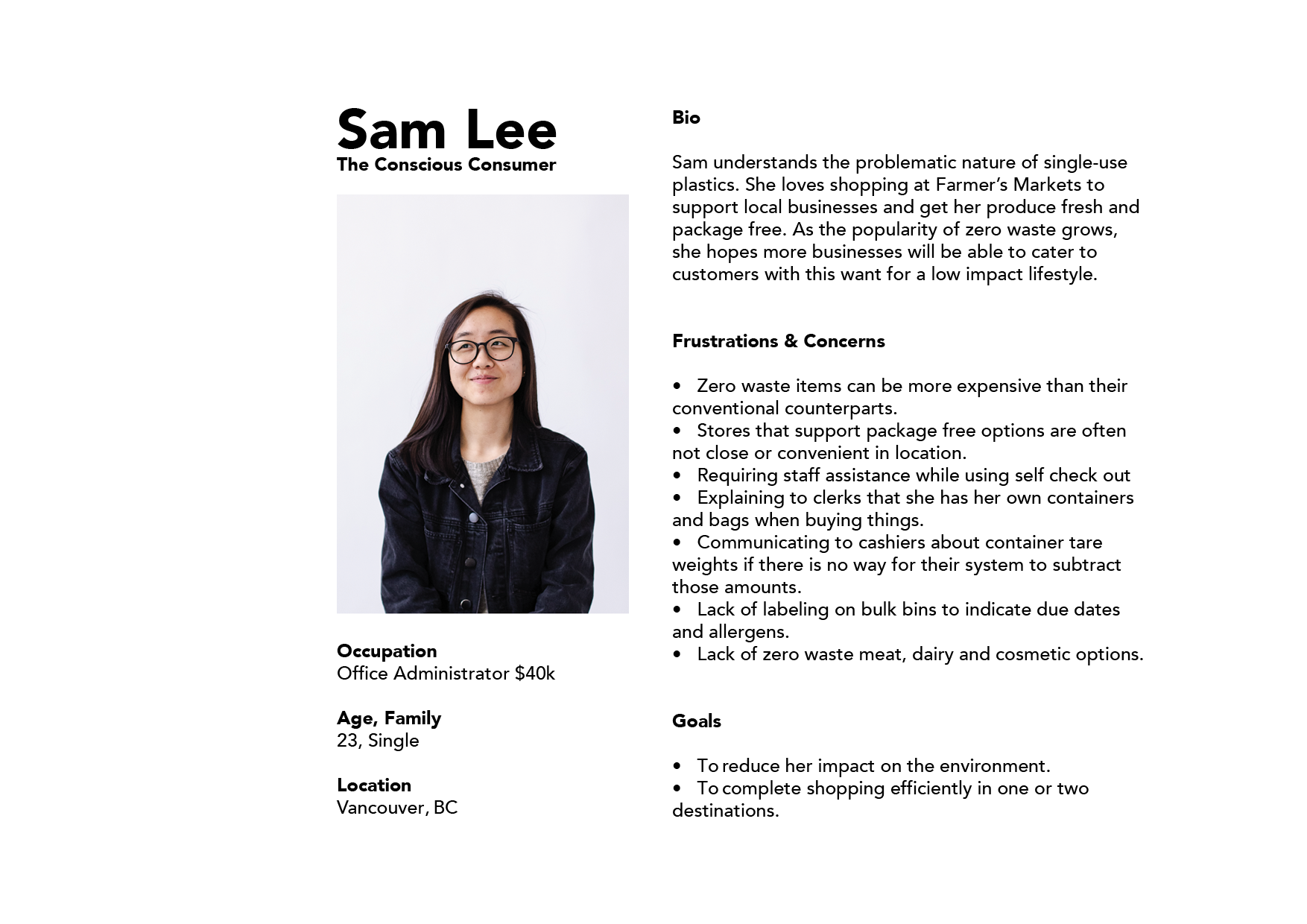

defining the problems
research takeaways
Based on the research performed, the challenges of package-free shopping can be summarized into two points:
- The container a customer brings into the store needs to be tared before they can purchase products.
- Due to the lack of packaging, there is also a lack of product information available to customers.
- Use a self-service store model to decrease line-ups
- Make product list available to customers online so they can compare prices and plan their shopping
- Assist customers in tracking product expiration dates etc.
- Allow customers to check out in-app or in-person
design decisions
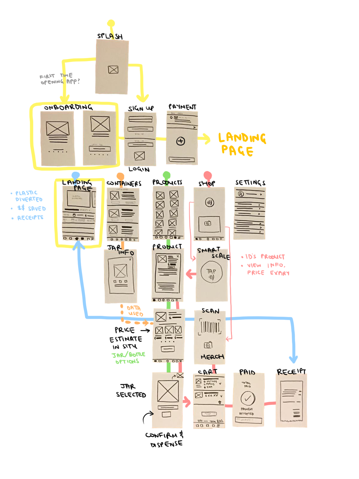
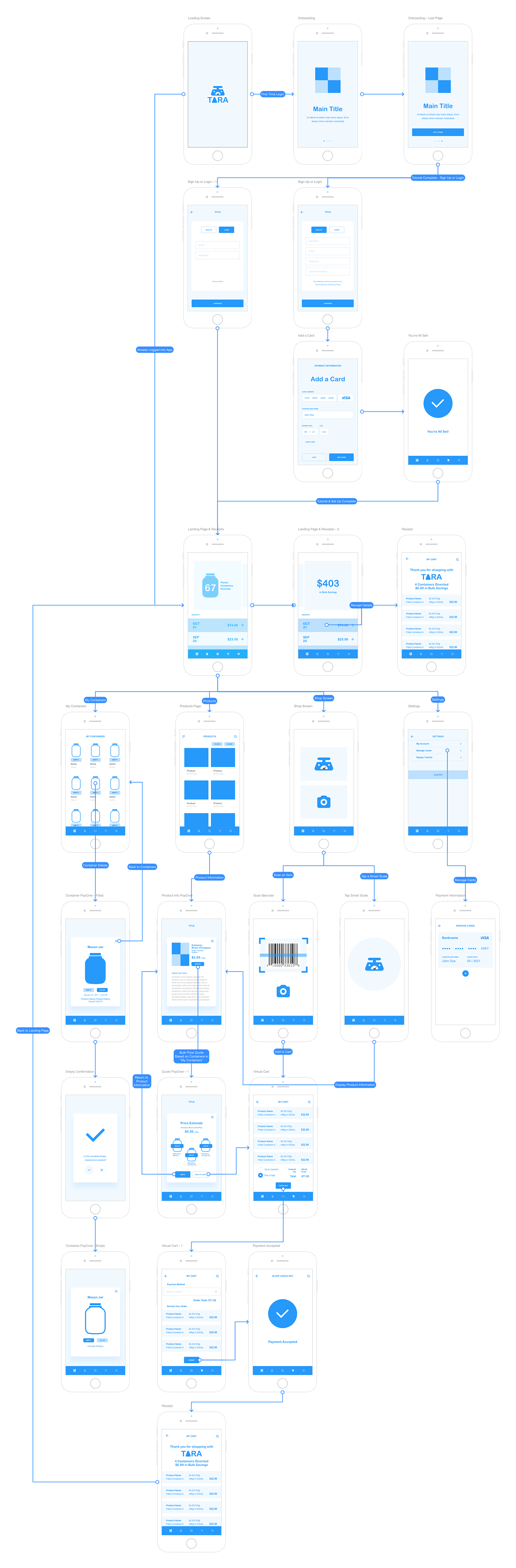
user flow chart
I used several card sorting exercises to determine the user flow of the app. This also visualizes the kind of information needed on each screen.

prototypes
paper prototyping
The user flow was then converted into screens for paper prototyping. User testing allowed me to solidify how screens relate to each other and what information the user may want to access on a certain screen.
wireframes
When I started translating the paper prototypes digitally, I realized that there many in-between screens were needed to link up the app experience.
branding
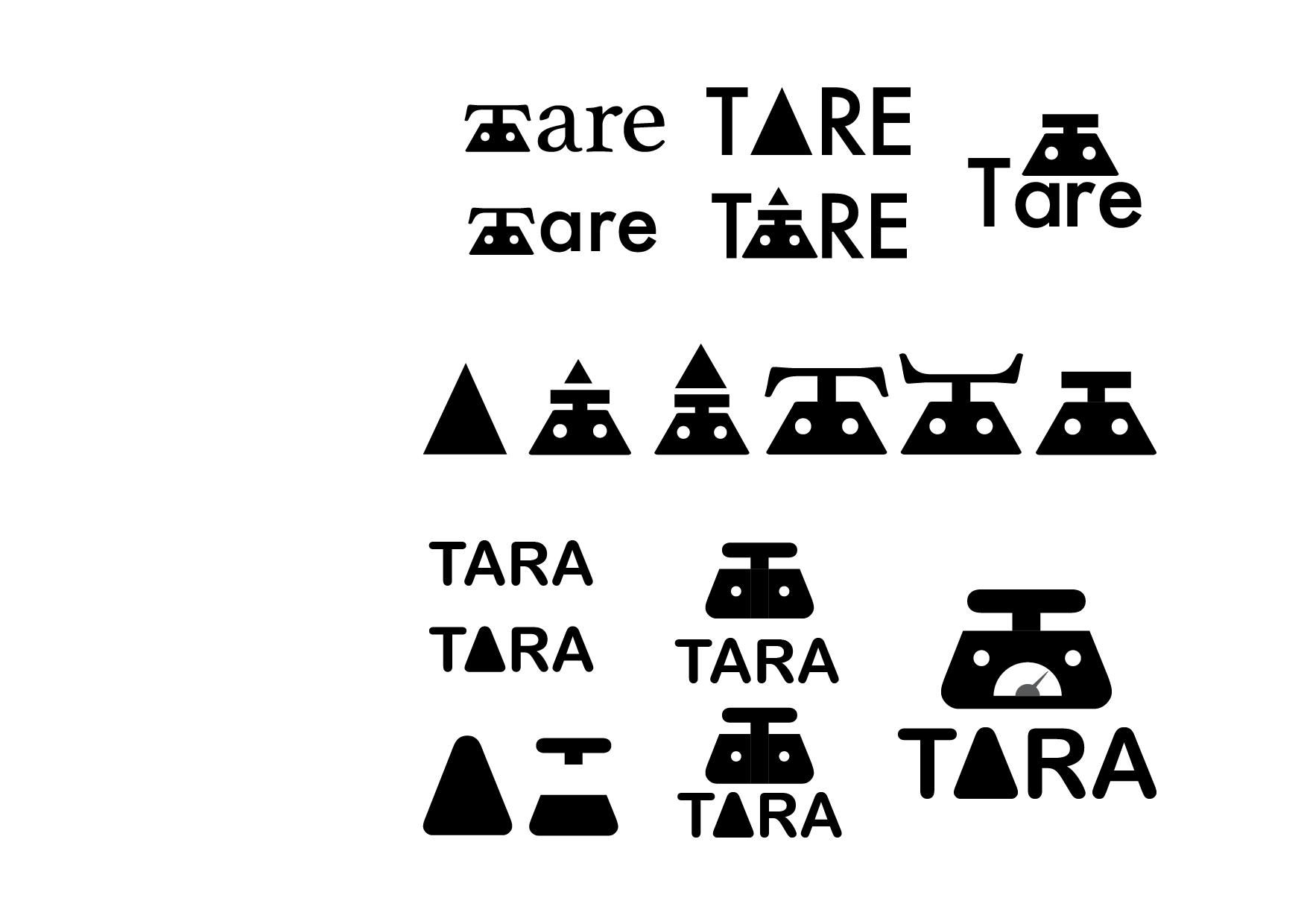
primary logo
logo process
The final logo is created from the 'A' and 'T' taken from the Arial Rounded MT typeface.
After creating a triangle from the 'A', it was deconstructed to form the base of the scale and completed by taking the top of the 'T' to form the weighing platform.
Alternative fonts and variations were tested before arriving at the final result.
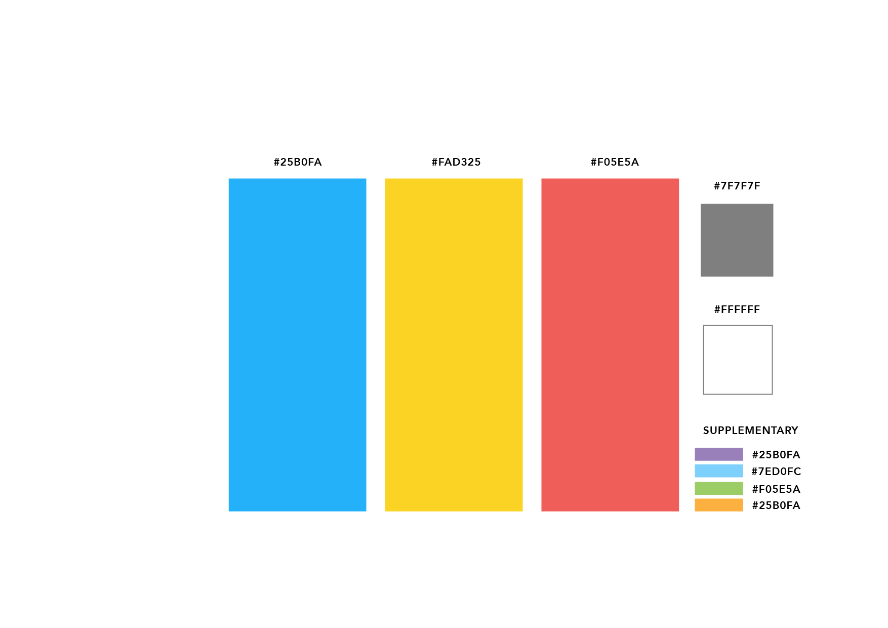
colour scheme
The colour palette of Tara consists primarily of blue and yellow with a red accent.
The grey and white are used respectively as the base typography and foundational background.
The supplementary colours are used for differentiating containers within the Tara app to allow for user customization.
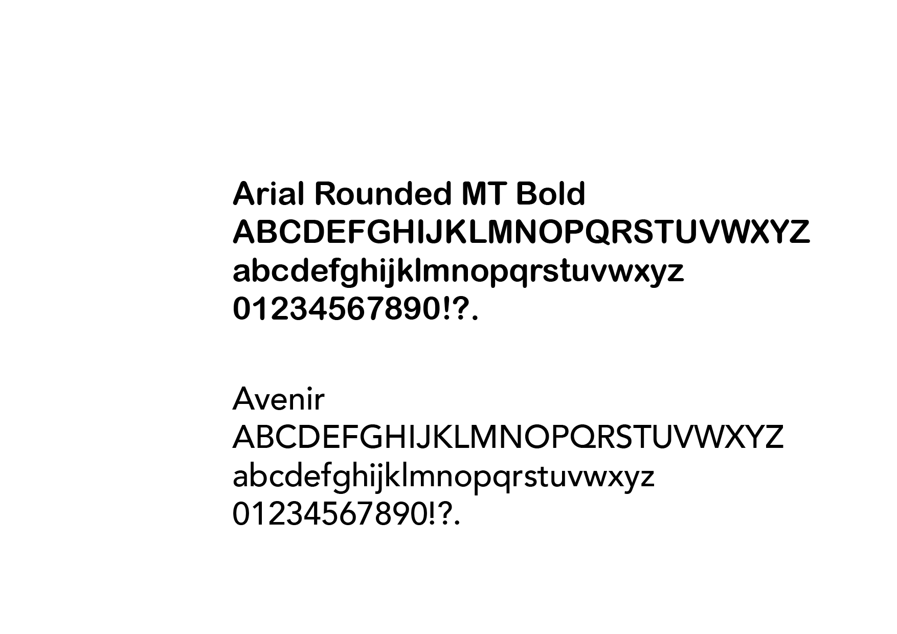
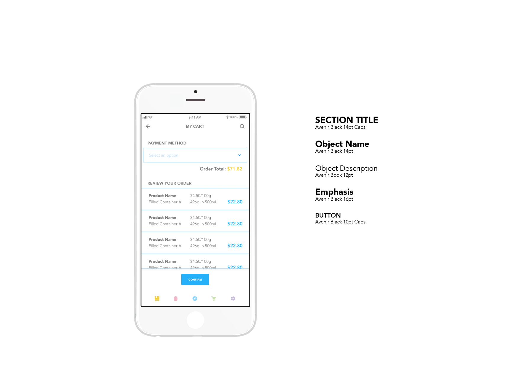
typography
Arial Rounded MT Bold and Avenir are Tara’s brand typefaces. Avenir is used for navigation and large bodies of text while Arial Rounded MT Bold is used primarily for decorative purposes.

reflections
I thoroughly enjoyed being able to build this experience after transitioning from my role at The Soap Dispensary to studying interaction design at Emily Carr.
My original ideation process actually included ideas for how the POS (point of sale) system and store flow might work as well, but due to the time allotted for this project, I focused solely on the mobile experience and assumed the other
two parts to be functional.
I know that the design of this application relies heavily on the 'smart scale' to be a reality. I am hoping to talk to a developer more knowledgable in NFC technology to see if this would be a viable path to take in the real world.