
keela mobile
Role: Product Designer at Keela
Date: January 2020
Industry: Non-profit fundraising
- 2 Product Designers
- 1 Product Manager
- 5 Full Stack Engineers
- CEO
- Marketing Team
- Customer Success Team
- Sales Team
problem to solve
Keela Mobile has been a highly requested feature for over 3 years. A mobile app was built for Keela 1.0, but because of legal limitations around accepting donations within the app, it was rejected from the Apple App Store. Due to the onset of Keela 2.0, the mobile project was put on hold while the web application was restructured.
Keela 2.0 launched in January 2020. The timeline for mobile 2.0 was scheduled for release in June 2020, but we would be building the mobile app from scratch. Our team spent a lot of time debating between building a native application, hybrid application or a PWA.
As a companion to the Keela CRM, we also had to make sure that the mobile app's features were chosen intentionally and didn't overwhelm our users.
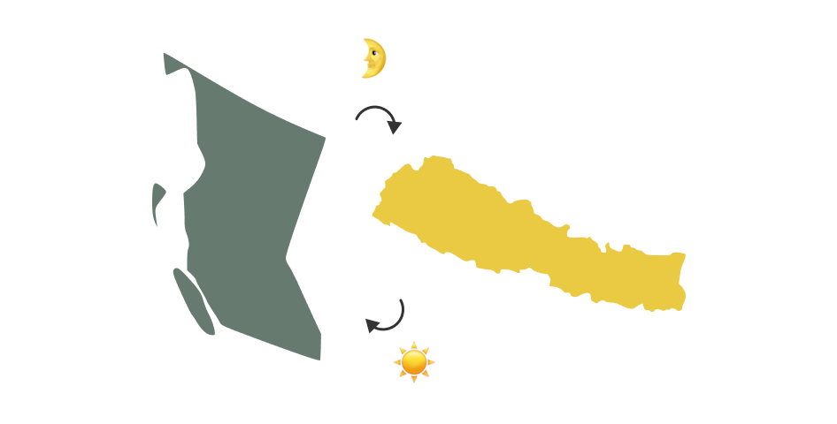
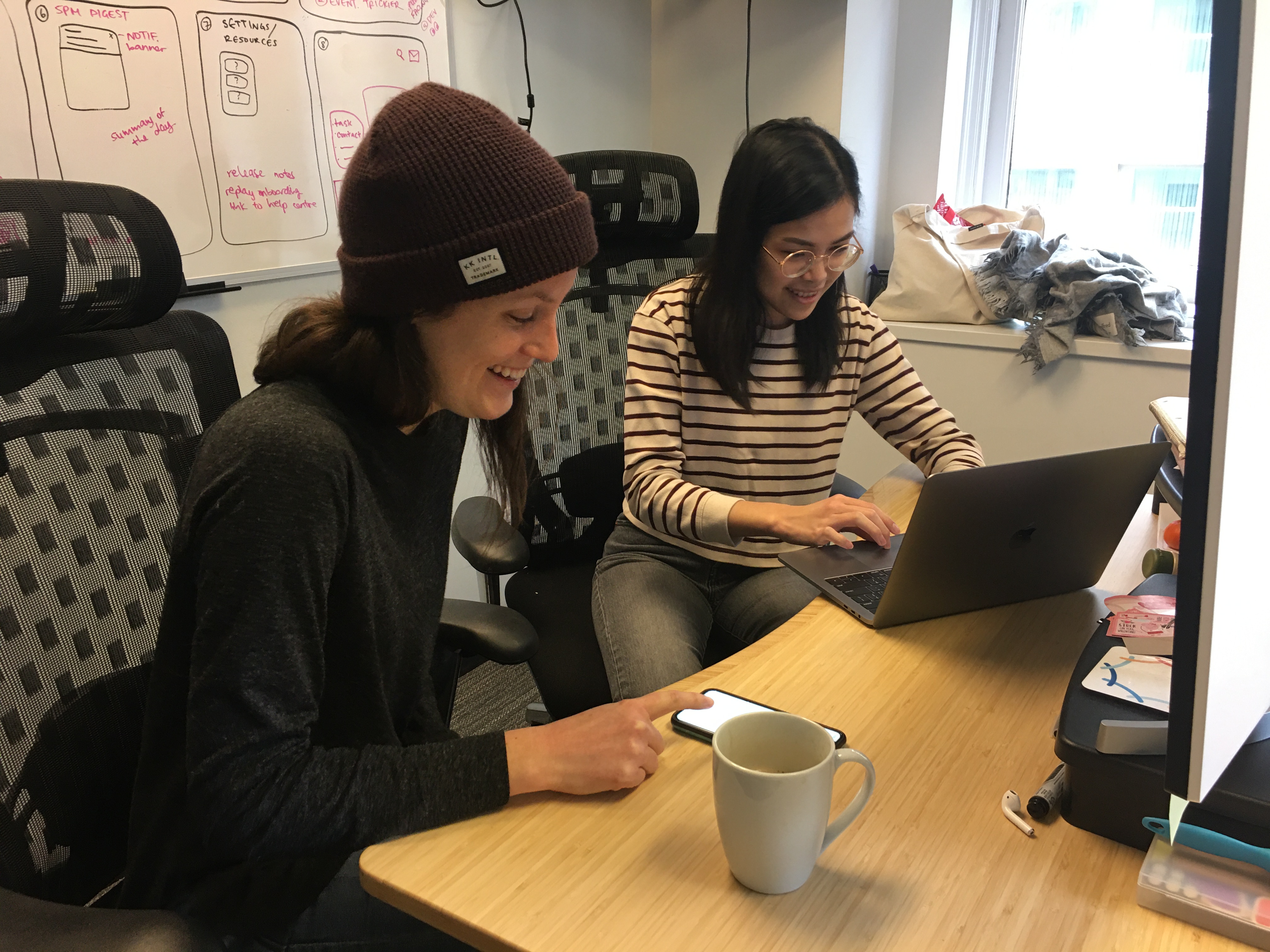
The engineering team working on the project was based out of Nepal and supported by our CTO in the Vancouver office. Although we were used to collaborating remotely with the Nepal team, the Vancouver team had also transitioned to working remotely due to COVID-19 and this brought on many new communication challenges.
our process
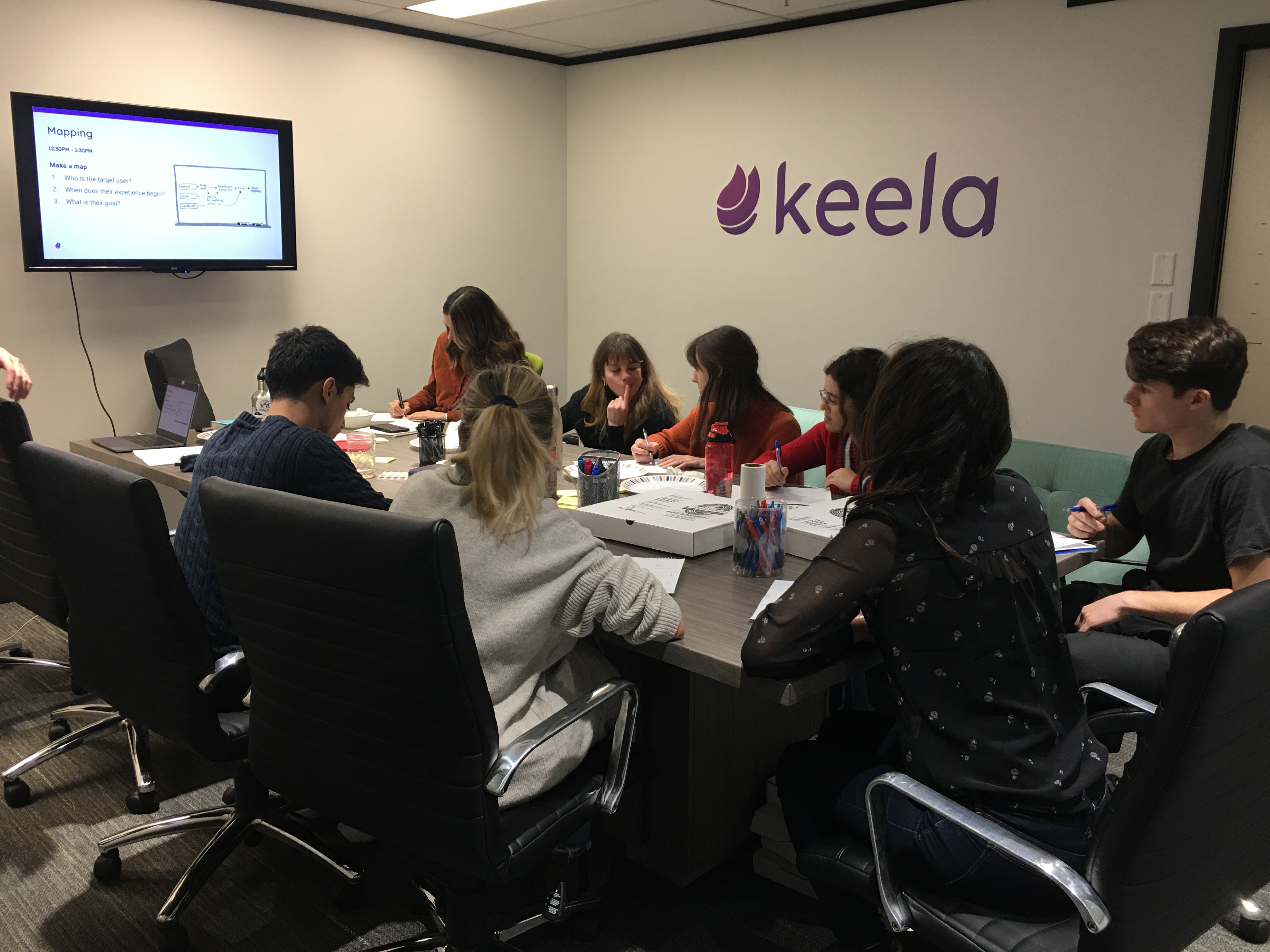
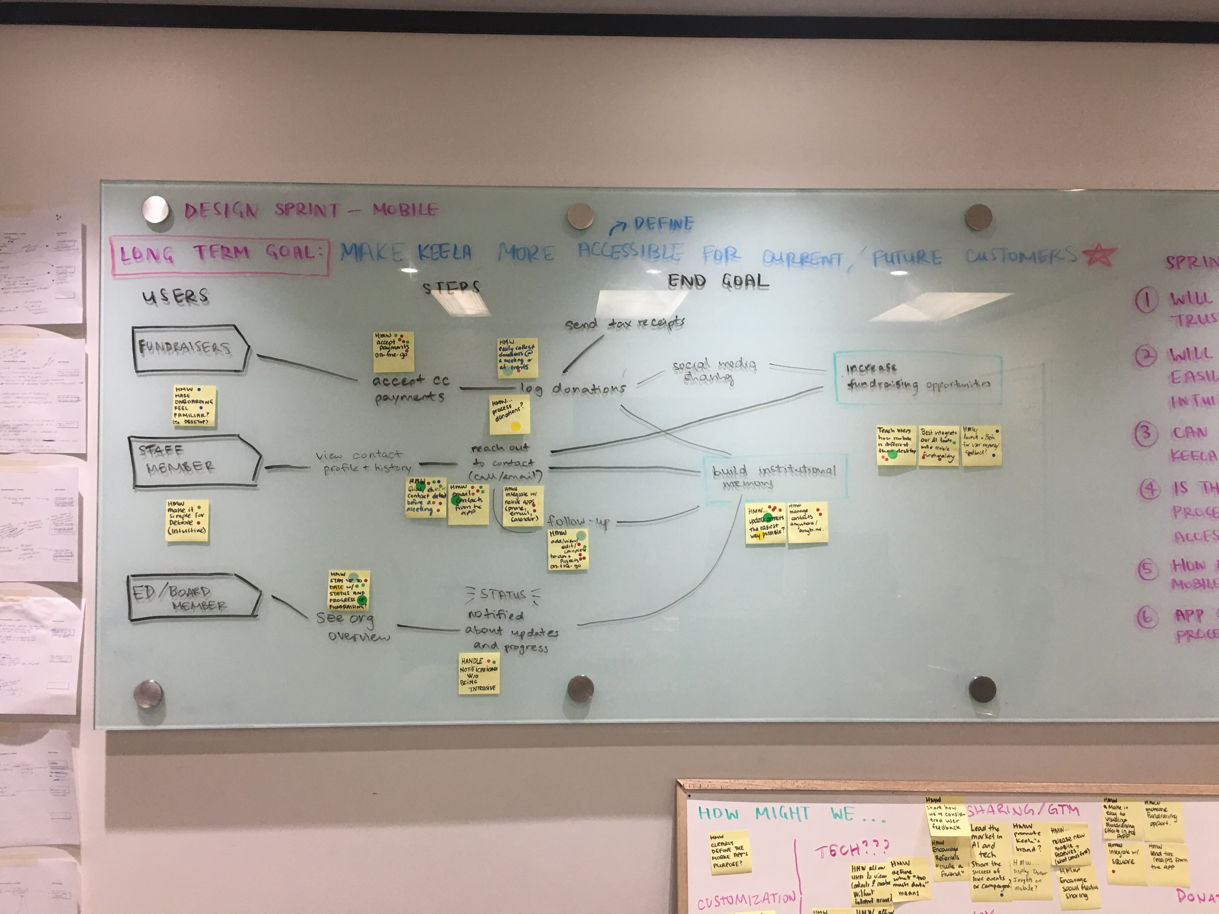
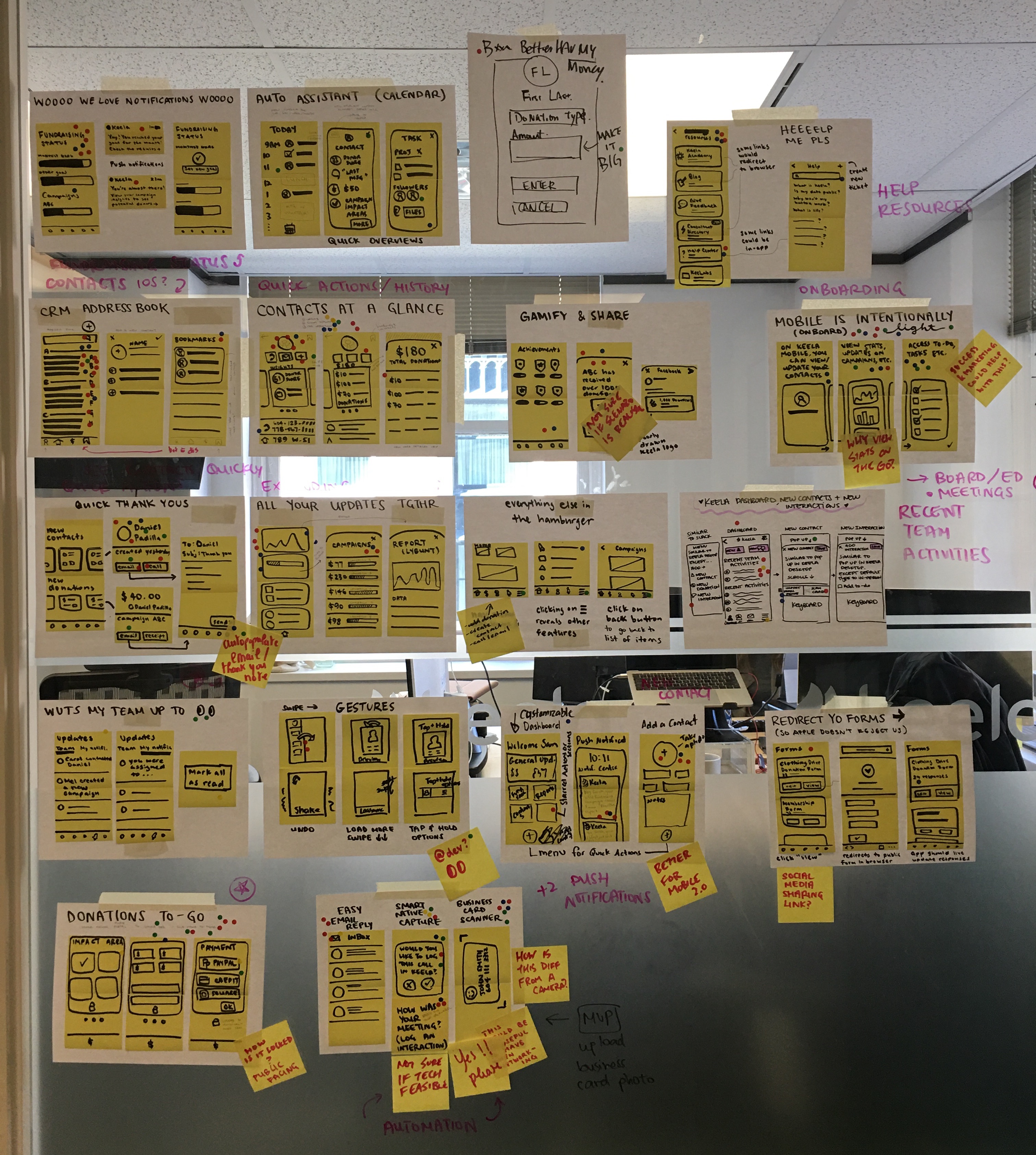
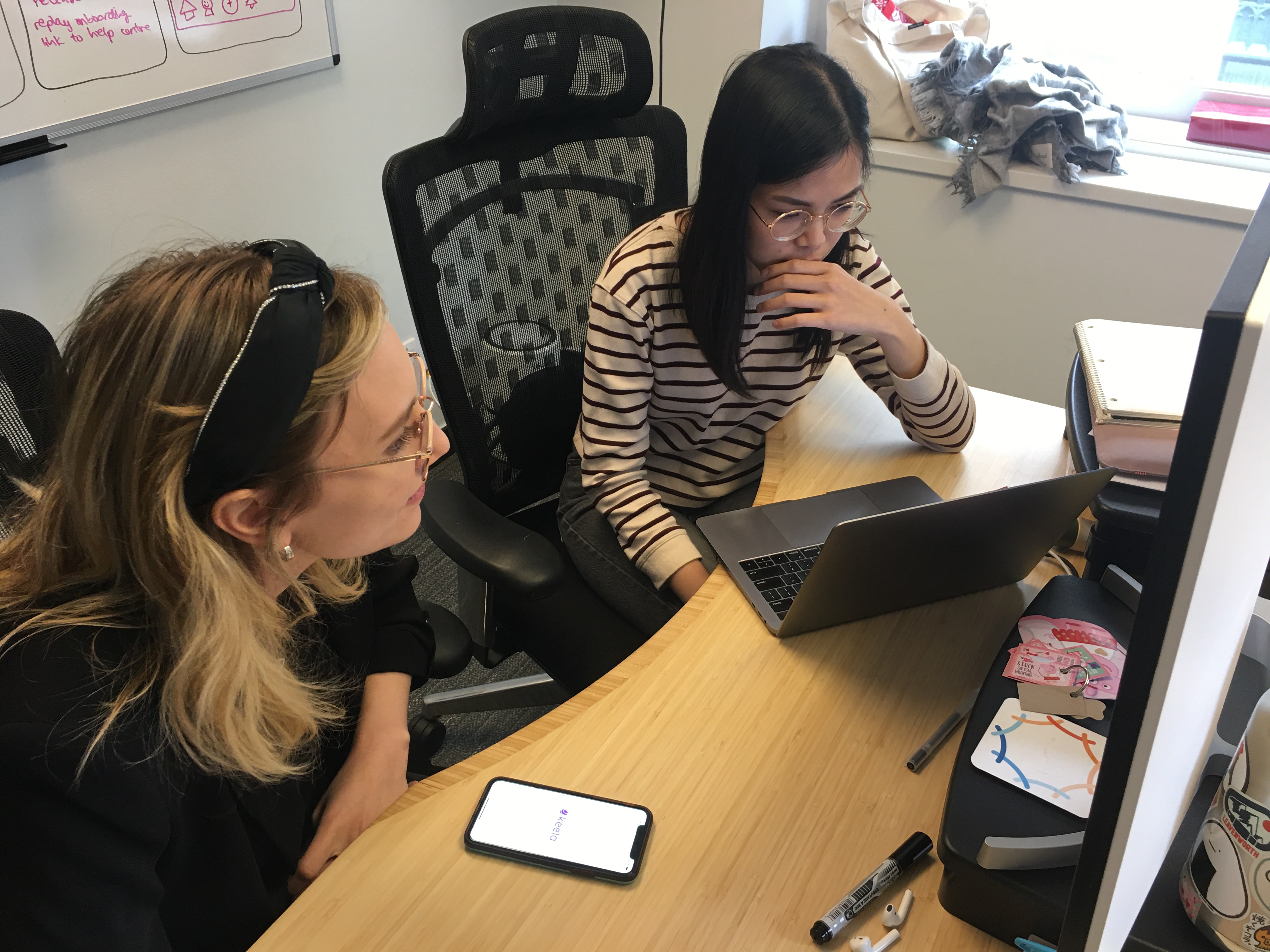
Since the current team didn't work on the 1.0 mobile app, we decided to start by running a design sprint and revisiting the problem from the perspective of the Keela 2.0 experience. This helped us ideate around the base features that we would include in the MVP version of mobile.
Learning from previous sprints, we knew it wouldn't be realistic to have the whole team available for all 5 days. So we sent out a schedule to our team in advance so we could grab input when our colleagues were free and provided sprint updates in the #design-sprint slack channel to keep everyone in the loop. Luckily, we were able to complete the sprint just before our office closed for the pandemic.
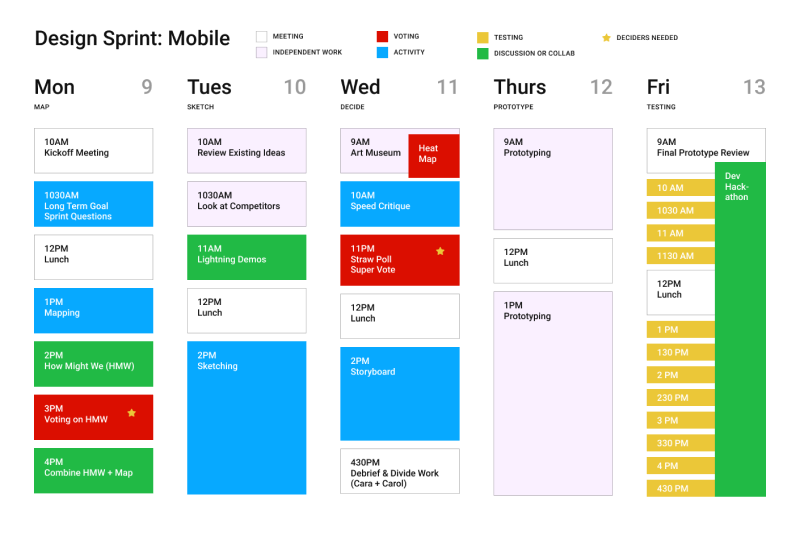
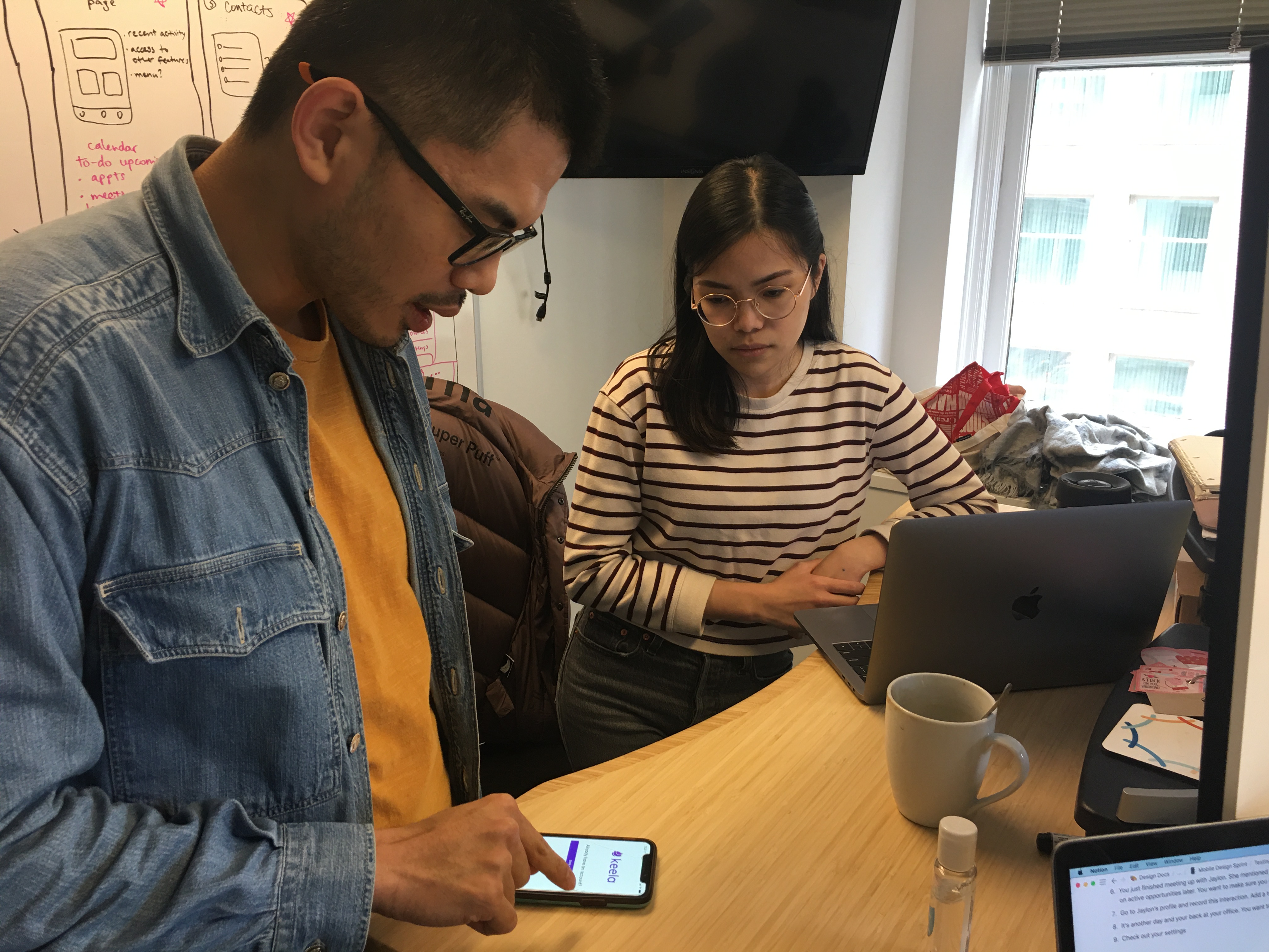
As mentioned before, we were unsure about what tech stack to use, and we thought it would be great to run a hackathon in parallel for our engineers to test out different frameworks. Since we would have a functional prototype by the end of our design sprint, it seemed fitting to hand this over to our devs while we did internal user testing with other teammates. We were able to make better decisions on what teck stack to use given its ability to support our designs and integrate with our database.
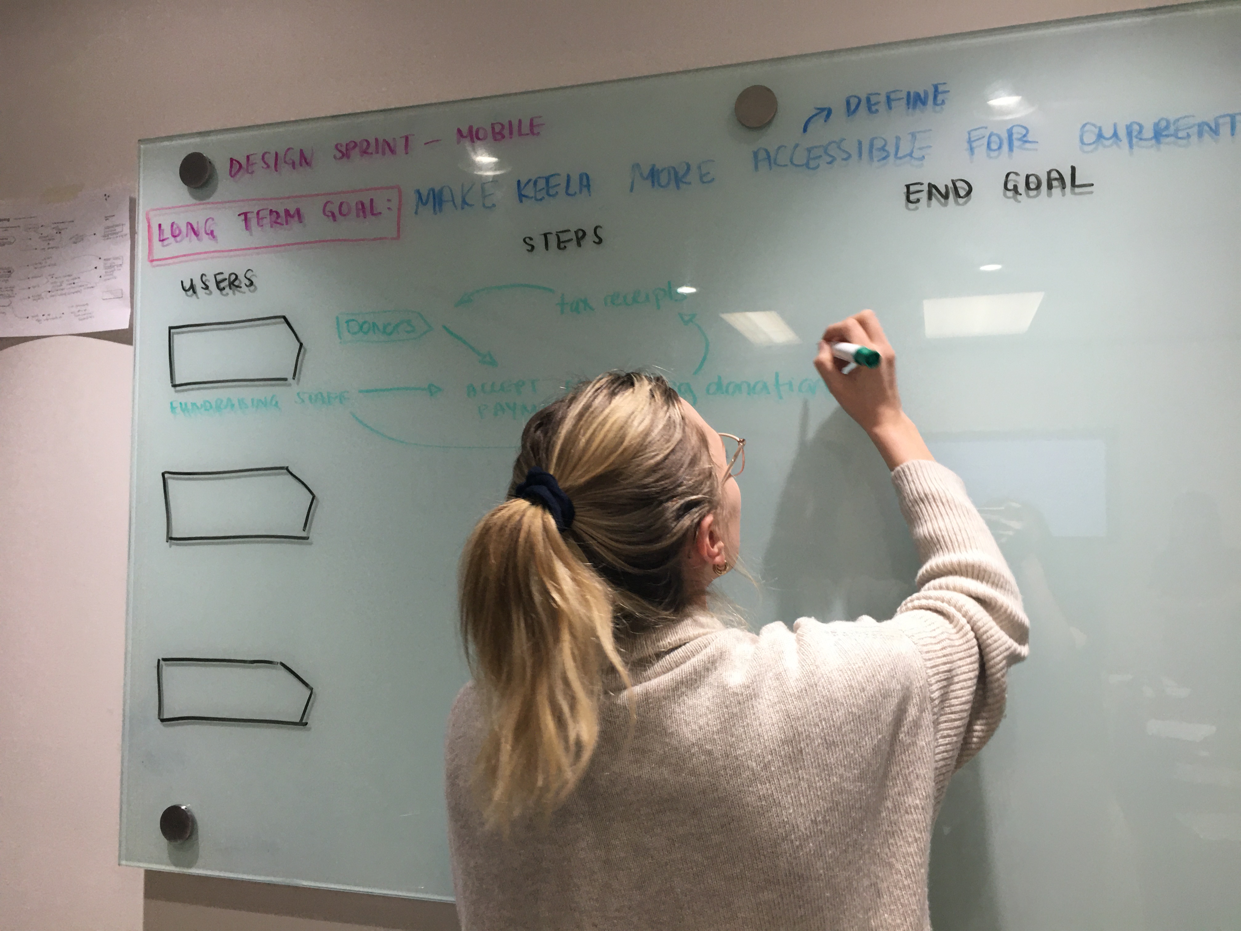
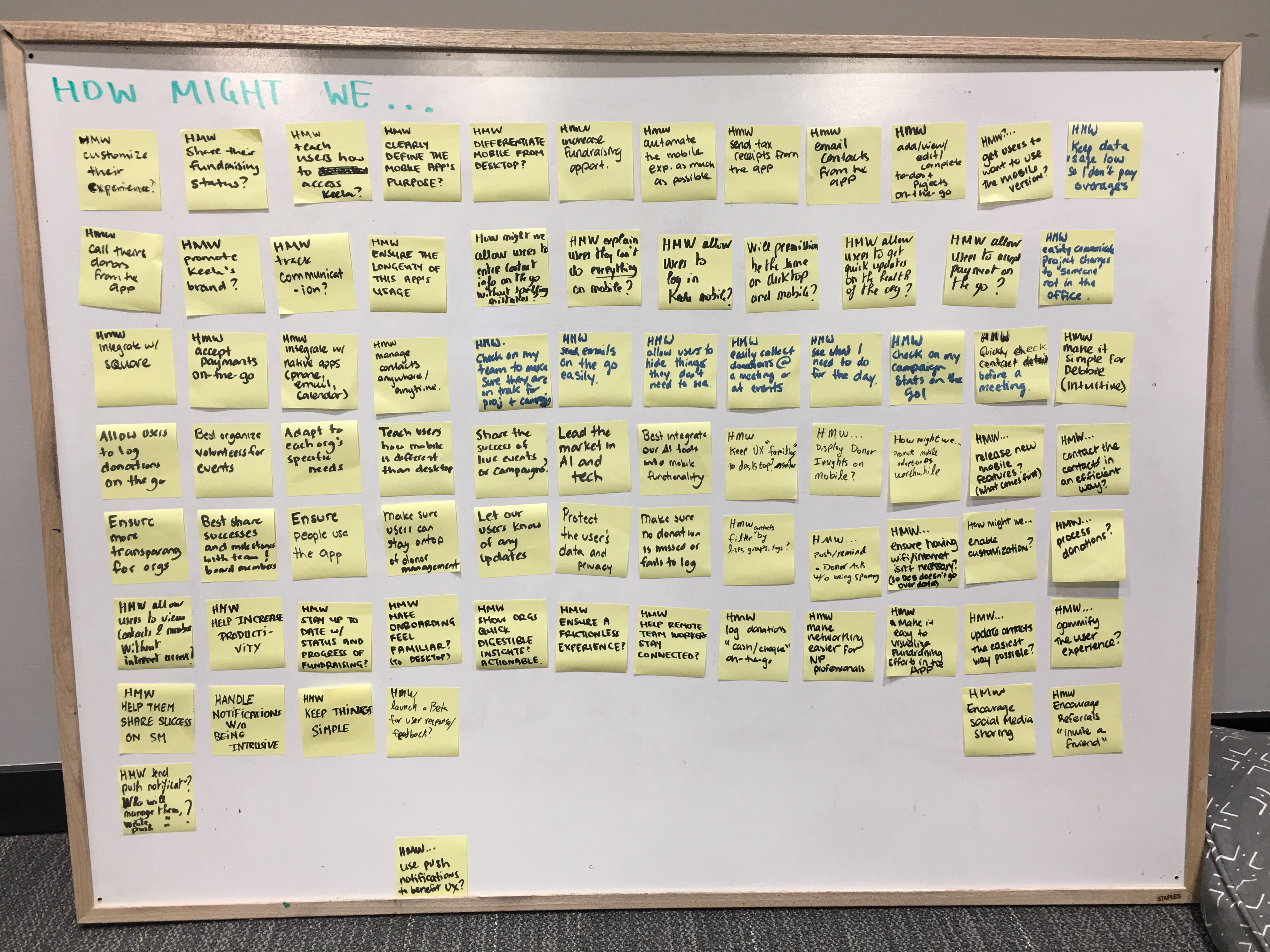
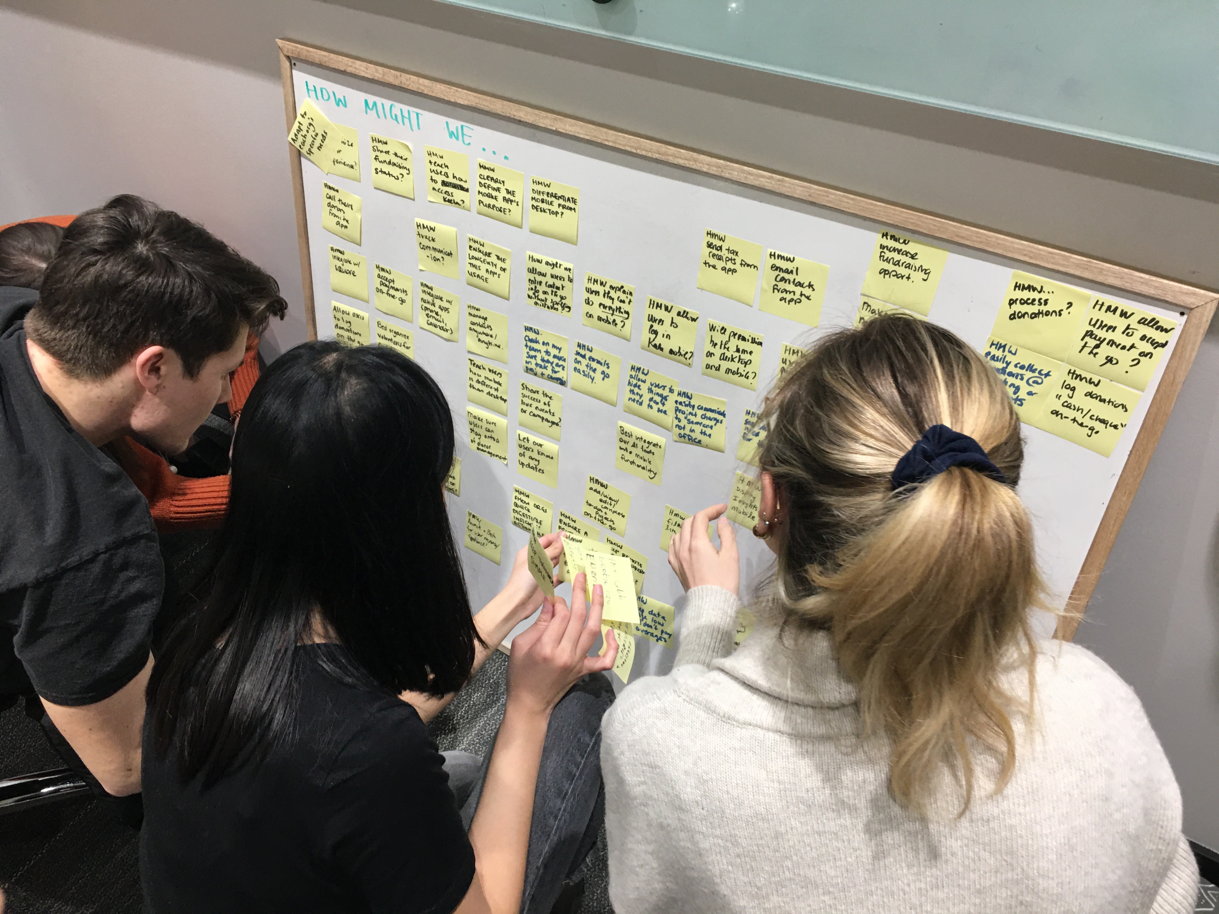
After defining goals and brainstorming with our team, we agreed that keela mobile should have a low tech barrier and be accessible for current and future customers. We also established that not every web app feature would make its way into the mobile app and the functionality needed for on-the-go fundraising scenarios were prioritized.
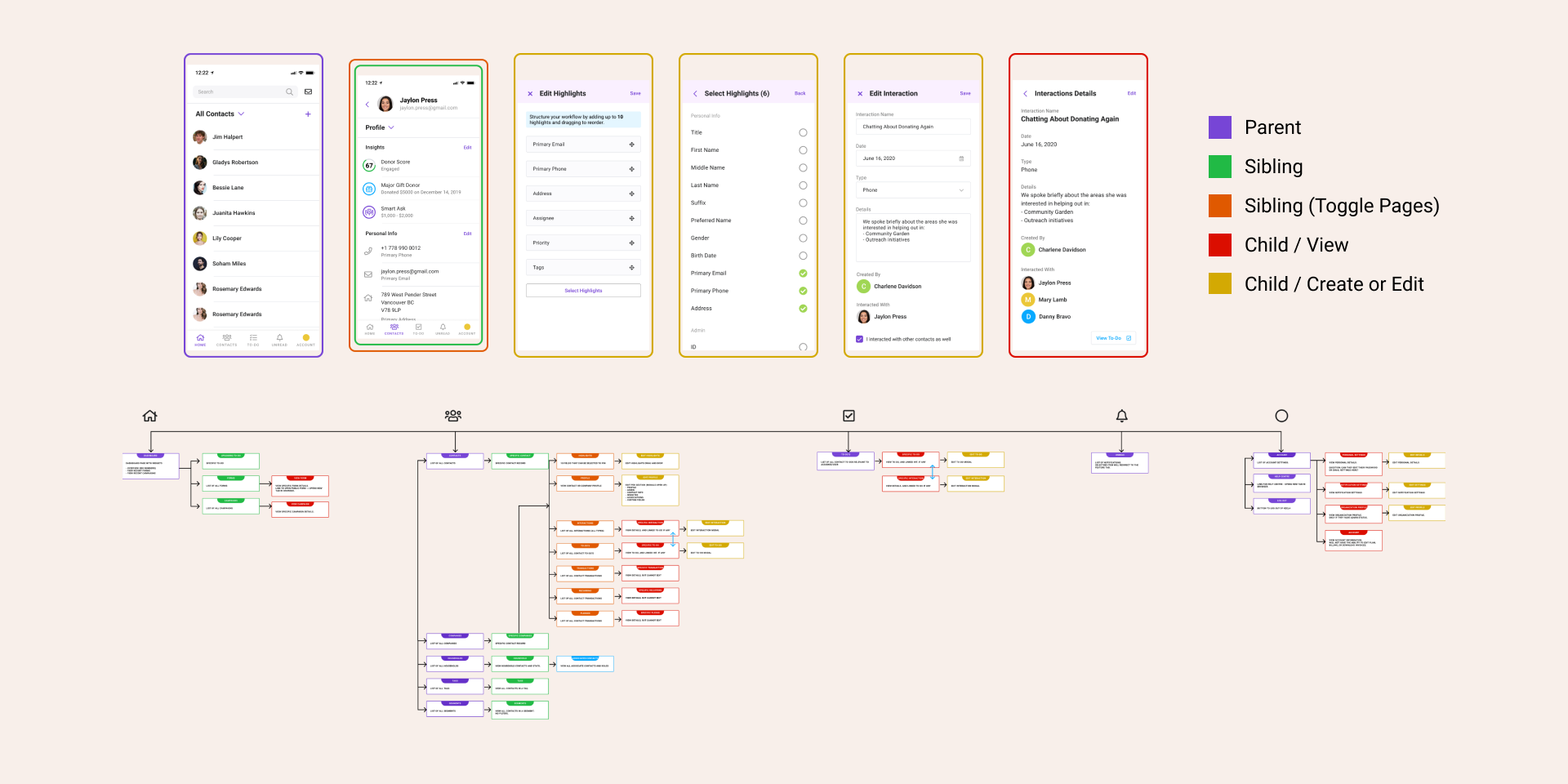
The feedback given to us during our design sprint helped make more formal decisions on the mobile UI framework we were going to use. We collaborated with the devs to understand what UI components were feasible and then built a mobile design system as a base for prototyping. This ensured that we would be using components that were technically feasible and had a documented way to communicate design changes with the Nepal team aside from our prototypes.
Every week, we would test our designs internally, have design reviews, share them with devs for more technical feedback and then iterate on the feature. Our design focus was to make the app feel familiar to the web application, but optimize it for a mobile experience.
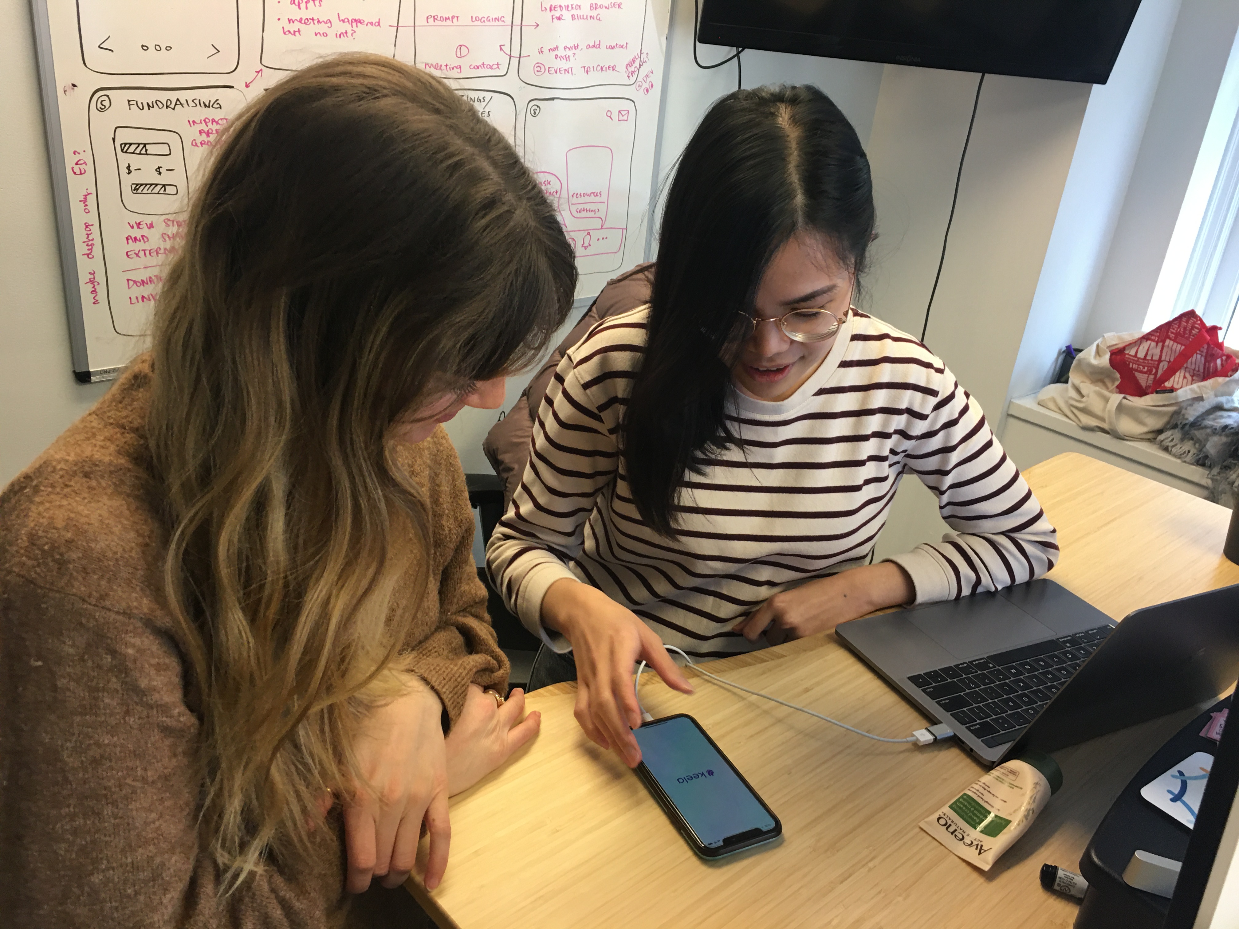
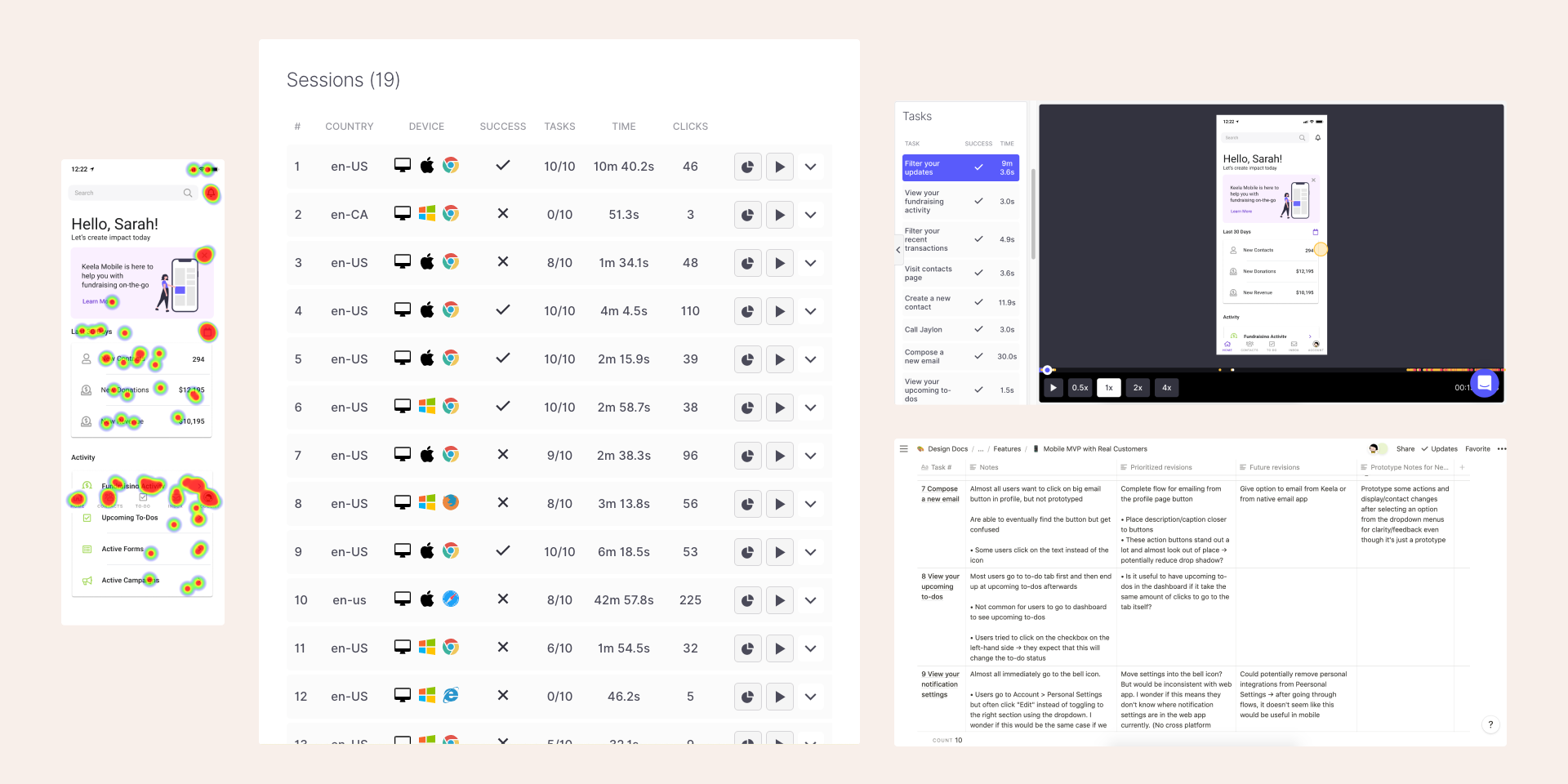
Once all the elements of the mobile MVP were prototyped, we combined all the features into a final prototype for external user testing as a final usability check. The testing was unmoderated and conducted through Useberry. We were careful to select customers that would be excited to test and not surprised that we were only working on mobile now. (Our customers have been under the impression that mobile had been in development for the past 2 years.)
After reviewing our testing results, we summarized our findings in a notion table and tweaked our designs where users struggled. It was great to see that areas where our team had gotten stuck earlier were no longer points of friction during the second round of user testing.
our solution
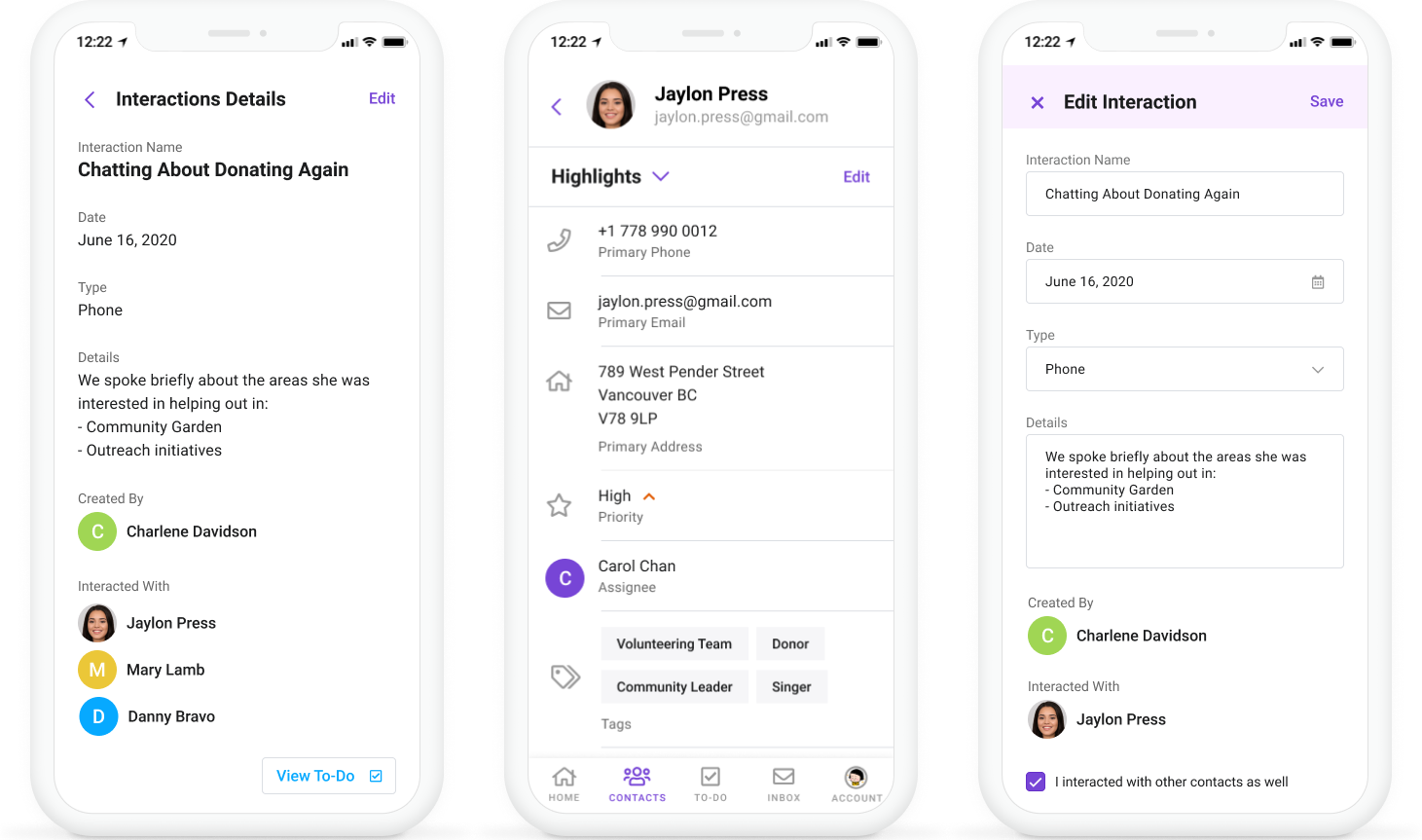
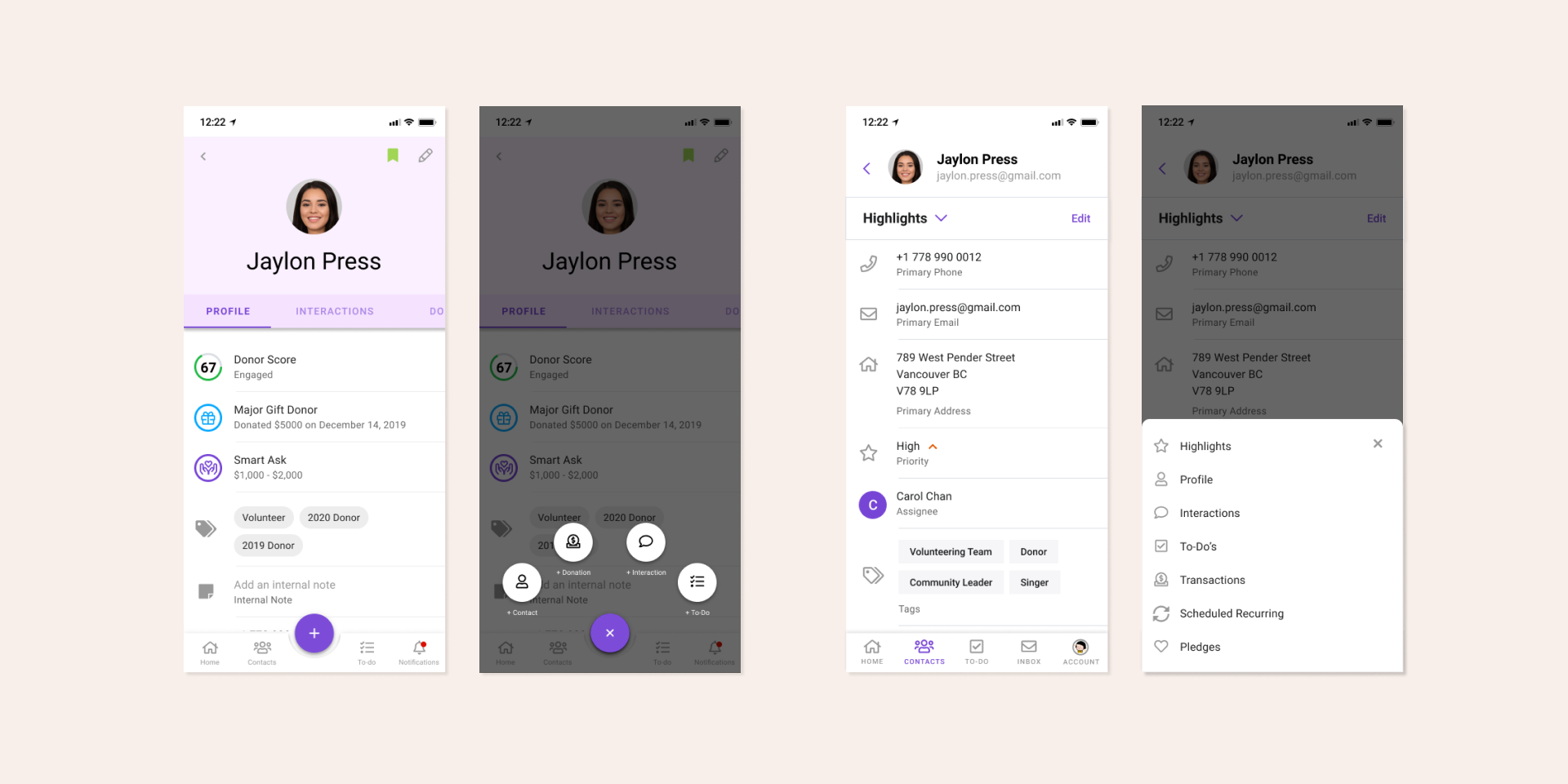
Our solution captured the main features that Keela users would need in an on-the-go fundraising scenario. We included functionality to quickly review a prospective donor's giving history and contact profile, a way to view upcoming to-dos, send emails and track interactions with contacts.
With the given timeline and limited resources, our leadership team felt that a PWA would be the best choice for the business. As a design team, we strongly advised against this direction, since it would be very challenging for our user base to understand and adopt a PWA. However, due to app store limitations, we decided it would be the safest route to go with a pwa. We worked with the success team to ensure that onboarding of customers would be as seamless as possible.
During the mobile release, the narrative we presented was that Keela is now tablet and mobile-friendly. It didn't have the same sparkle as releasing a native mobile application, but it solves the on-the-go scenario for our organizations. Additionally, amidst the COVID-19 pandemic, we weren't sure the usage of a mobile solution would be the same as before.
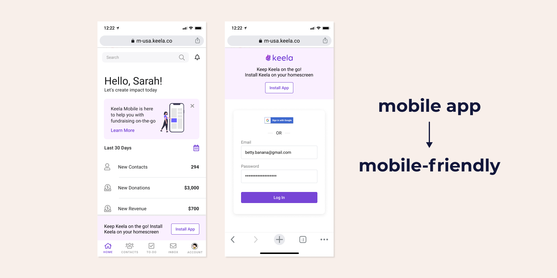
Finally, to lighten the load on our success team, our engineers added ui prompts to make the pwa downloading process easier for our older demographic. During user testing, only 30% of our own team knew how to save a pwa to their smartphone's home screen, so we anticipated it being a big challenge for our users.
reflection
Overcommunication during transitions
Moving to a fully remote working environment took some time to get used to. During this adjustment period, a lot of our existing communication problems were amplified. This was a blessing in disguise though, because it forced us to find solutions for limitations in our process that we may not have addressed for some time if not for changing our work style.
Moving as a team
We won't always have conditions to build the best user experience despite our best intentions. As a design team, we are responsible for bringing our perspective to the table so that the team can make an informed decision. Although it can be challenging, once the decision is made, it's important for us to stand behind it as a team and pivot together to solve the problem at hand with limitations in mind.